Customer Success Story
Global E-commerce Software Provider cleverbridge Creates Modern Web Client Support Center Featuring Customized Content and Responsive Design with MadCap Flare
Goals
- Design a modern, intuitive HTML5-based Help website featuring top navigation that creates an appealing experience for users.
- Facilitate the ability to customize content for different types of users through content reuse and single-source, multi-channel publishing.
- Make it easier for users to navigate the online Help and find the information they need.
Benefits
- Efficiency: Flare’s topic-based single-source publishing and snippets facilitate content reuse, and simplify the creation and delivery of cleverbridge’s Help website.
- Intuitive User Experience: The HTML5-based Help site created with Flare features responsive design and top navigation to provide users a modern, intuitive web experience on their devices of choice.
- Easy Customization: Cascading style sheets enable cleverbridge’s writers to style and customize the look and feel of the Client Support Center to align with the corporate website.
- Easy Navigation: Expand/collapse sections, tables of contents, and Google-like search make it easier for users to find information and only view what they want to see.
MadCap Software Solutions and Services:
When organizations around the world seek global e-commerce, billing and payment solutions for their digital goods, services, and software as a service (SaaS) offerings, they increasingly turn to cleverbridge. The company’s cloud-based ecommerce platform simplifies recurring billing, optimizes the customer experience, and offers comprehensive global payment capabilities–all in one place. Relying on cleverbridge’s flexible platform and unique consultative approach, clients across a range of industries are growing their digital businesses by building long-term customer relationships and maximizing global recurring revenue.
In supporting clients’ and internal users’ use of its e-commerce platform, cleverbridge has placed a priority on delivering documentation via a modern web experience. Today, cleverbridge executes on that initiative by delivering an HTML5-based Help website with top navigation and responsive design that automatically adjusts to users’ screens regardless of the devices they use. The site was built using the single-source, multi-channel publishing and modern web design capabilities of MadCap Flare.
Need for Modern Online Help
Since 2012, cleverbridge has used MadCap Flare to deliver its documentation and user guides. However, both the company’s employees and clients found it increasingly difficult to navigate the PDFs and find information.
“We had to manually upload an overwhelming number of documents to a website, and we lacked search capabilities across the PDFs,” recalled Juliane Knobloch, technical writer at cleverbridge. “It was an inefficient and outdated approach to delivering content.”
Being able to publish to different outputs from a single Flare project has helped us to reduce the time it takes to update documentation so that we can keep pace with product updates.
Andrew Smith Technical Writer, cleverbridge

In early 2016, the cleverbridge technical communications team decided to move to an online Help system that would be intuitive and easy to search. To ensure that they would be using the right software for the website, the team began an evaluation process, which included a workshop with a technical communications consultant highly familiar with MadCap Flare. The workshop reconfirmed that MadCap Flare provided all the features cleverbridge’s writers required to design, build and maintain the website.
“We realized that all of our requirements would be met with Flare’s robust features, such as top navigation and enhanced search functionality,” said Andrew Smith, technical writer at cleverbridge. “An added plus was that staying with Flare would enable a much easier move from PDF output to the web and take up fewer resources than if we were to switch to another tool.”
Delivering a Modern Help Website
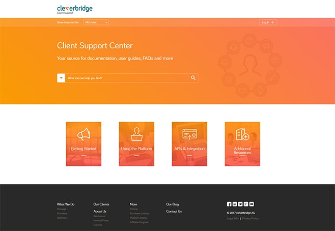
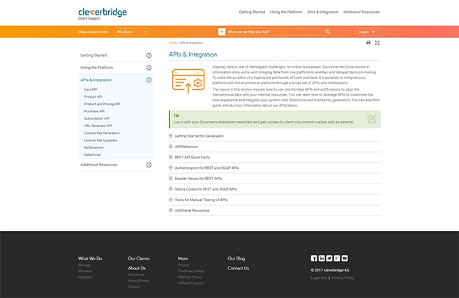
Today, cleverbridge relies on MadCap Flare to deliver its HTML5-based Client Support Center, which contains documentation and user guides to support the company’s e-commerce platform. Integrated into the Help website are six different audience-specific outputs that cleverbridge’s prospects, clients and employees can view via three navigation-level views. All users can access the content specific to their roles by using a drop-down list to choose the appropriate user view. Clients and employees can access additional content by logging in.
“MadCap Flare’s single-source publishing makes it so simple to create and publish content for our different groups of users,” Smith observes. “Being able to publish to different outputs from a single Flare project has also helped us to reduce the time it takes to update documentation so that we can keep pace with new product versions.”
At the same time, the cascading style sheet (CSS) functionality in MadCap Flare has allowed the technical communications team to make extensive customizations to the Help website, so that it reflects cleverbridge’s corporate website.
“It was amazing to see how quickly it took the designer we worked with to implement our style requests using Flare. I thought it would take three times longer than it actually did,” Smith said. “It just shows how intuitive the MadCap Flare application is.”
It was amazing to see how quickly it took the designer we worked with to implement our style requests using Flare. I thought it would take three times longer than it actually did.
Andrew Smith Technical Writer, cleverbridge
Smith also notes, “Flare’s cascading style sheets give us so much flexibility to experiment with arranging content and styling the site. For example, we’ve been able to move the side-navigation, implement a customized header to enable visitors to switch between the different HTML5 outputs, and create a login button so clients can access additional content.”
Additionally, cleverbridge’s writers have been able to speed the development and delivery of content using the snippets, topics, and table of contents (TOC) capabilities in MadCap Flare.
“All of our content is in snippets, which allows us to maximize content reuse in our TOCs, drop-downs, and different locations on the website,” Knobloch explains. “We can then pull the snippets into our topics and build larger pages with all the information behind the drop-downs. As a result, we’ve been able to eliminate redundant efforts, enabling us to both streamline authoring efforts and deliver content significantly faster.”
Once they have developed documentation, cleverbridge’s writers then rely on MadCap Analyzer, which is fully integrated with MadCap Flare, to enhance the quality of the Help content. The software evaluates cleverbridge’s Flare-based content to ensure there are not any broken links or other critical issues, and it makes recommendations for correcting them.
“MadCap Analyzer has been really useful in helping us to make sure everything works properly before we publish,” Smith notes. “We’re now able to stay on track and do timely updates.”
Enhancing the User Experience
cleverbridge’s writers leverage a number of features in MadCap Flare to deliver an inviting, modern web experience for users, including top navigation and drop-down text.
“Flare’s top navigation has played a significant role in helping us to implement a state-of-the-art website that users find easy to use,” Knobloch observes. “Meanwhile, the drop-downs have made it possible for us to limit the number of navigation levels to just three, making the content much less cluttered and easier for clients to navigate.”
Similarly, drop-down text in MadCap Flare enables cleverbridge’s writers to minimize the amount of content that appears on a page.
“Being able to collapse sections of text under links in a topic helps users scan for information more quickly without being overwhelmed when they look at the screen,” Knobloch says.
Also facilitating users’ ability to find information is the addition of search functionality.
Flare’s top navigation has played a significant role in helping us to implement a state-of-the-art website that users find easy to use.
Juliane Knobloch Technical Writer, cleverbridge

“Using Flare’s robust search capabilities, we’ve been able to incorporate search filters that mirror the site’s top navigation elements. It’s completely transformed the way clients and employees are able to access and locate content,” Knobloch notes. “Previously, all of our information was located in a large number of unsearchable PDFs. Now, users can quickly and easily get to the topic they’re looking for.”
Additionally, the cleverbridge online Help features a responsive design that automatically optimizes the view of content for different screens, so users can access it from any device.
“Thanks to Flare’s responsive design functionality, we can provide a consistent user experience for our clients regardless of the device they use to access content,” Smith explains.
The team also takes advantage of MadCap Capture, which is integrated with Flare, to easily capture and edit screenshots and graphics for the Client Support Center. To enhance users’ interactive experience, cleverbridge is looking at using MadCap Mimic to create informative videos.
Optimizing the Help Website via User Testing
Central to cleverbridge’s success in rolling out the Client Support Center was the extensive live user testing conducted by the technical communications team. This provided an opportunity to understand what aspects of the Help website needed to be more intuitive, so that the team could make changes before making it available to everyone.
“Getting feedback from both internal and external users was super useful in determining what actually worked and what didn’t, so that we were able to fix issues before the site actually went live,” Knobloch explains.
For example, some users who had relied on the old PDFs were not familiar with basic web search logic, so the writers inserted search tips at the start of each search results page. Pulled from the Flare documentation itself, these tips enable users to learn how to narrow their search results if they can’t find what they’re looking for.
Using Flare’s robust search capabilities, we’ve completely transformed the way clients and employees are able to access and locate content.
Juliane Knobloch Technical Writer, cleverbridge
Another observation from the user testing was that clients were going directly to the boxes at the bottom of the site’s home page instead of looking at the top navigation menu. This led the writers to move important, top-level information to those boxes, and then use CSS to blend out the top navigation on the home page while leaving it on the subsequent pages.
“The ability to customize the look of our Help website’s home page using cascading style sheets and other features in Flare really points to the strength of the product,” Smith observed.
The Client Support Center is in full production, but the cleverbridge team continues to solicit user feedback.
“If there are inaccuracies or missing information in the documentation, people can now see it and give us quick feedback by sending us a link to the page with the error,” Knobloch explains. “It’s been a huge benefit of using Flare to deliver our Help website.”
Knobloch adds, “We wanted to move everyone away from PDF-based communications and just offer online Help unless someone asked for PDFs. And so far no one has!”


