This guest blog post was written by Jack DeLand. Jack has provided Help projects and/or Help authoring training to Fortune 50 companies around the world for over 30 years. He specializes in MadCap Flare project development, architecture, and design, and resides in Ypsilanti, a small city next to Ann Arbor, Michigan.
Abstract
This project upgrade came about, as all good things do, from end-user feedback. After implementing the previous version of the Show/Hide Table of Contents (TOC) project linked here, I found that users were expecting the TOC state (open or closed) to persist for each additional visited page until the user switches the state back by clicking the TOC icon again. In their words: “How come the Contents doesn’t stay hidden when I go to another page? I expected it to stay off until I turned it back on.” Let’s fix that.
This pre-built example includes JavaScript and icons embedded in a topic toolbar skin. It also includes a lot of custom functionality that you will discover in the style sheets and other files, which you may re-use anywhere free of charge. Just don’t sell them. Experiment!
All Users—Always test on a “throwaway” copy of your project before making any wholesale changes.
Beginning Flare Users—If you’re a beginning Flare user or just in a hurry to test, unzip the completed sample project linked here and build your own files and functionality upon this base.
Experienced Flare Users—If you’re an experienced Flare user and want to modify an existing project, unzip the completed sample project linked here and copy components from it to modify your own. Changes include:
- Adding the custom toolbar to a template page
- Editing a style sheet
See “Modifying an Existing Project” below.
Why Hide?
I like the precision and ease of use of a stacked, left-side navigation scheme, but when reading long passages online I prefer a simple, uncluttered layout with no distractions. Compare these two examples of the same page (https://www.howtoreadpoe.com/content/h-autography/autography_05.htm):
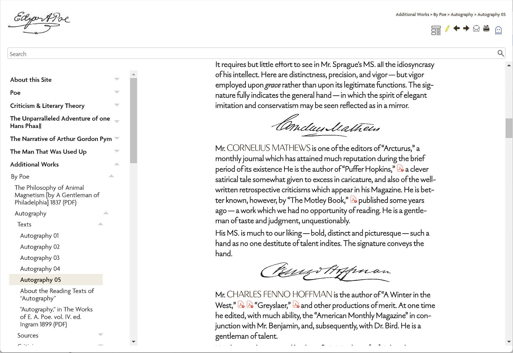
Informative, but busy.
and:
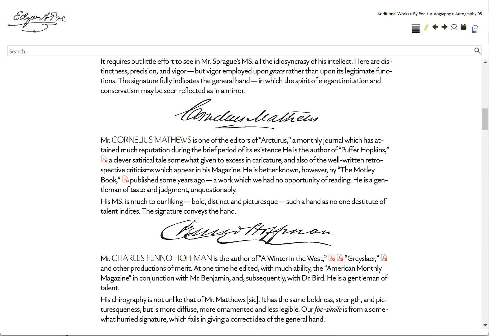
More relaxed.
Printing is unaffected by the TOC switch because the Contents frame is not sent to the printer.
How It All Works
As a consultant, I’ve learned to consult with other consultants, so to speak.
The functionality for the TOC switch is adapted from open-source code provided by Mattias Sander, built upon my custom Edgar Allan Poe website project template. Mattias develops the Kaizen Toolbar plug-in for Flare and provides Flare automation services. Incredibly, this must-have plug-in is still available free! Get it at www.improvementsoft.com.
Note: I was fortunate to have Dave Lee correct my code. He’s a brilliant CSS diagnostician and speedy―an ideal reviewer.
JavaScript
The toolbar JavaScript provided by Mattias (specifically, the “.sidenav-wrapper” class) toggles the toolbar icons and changes the display of the Contents frame when a user clicks the Contents icon to activate the Show/Hide function. Lines that begin with // are Mattias’s code comments. Note that text wrapping may push the lines around a bit:
<Script>$(document).ready(function () {

// Function to handle TOC state persistence

function updateTOCState(state) {

sessionStorage.setItem("TOCState", state);

}


// Check and apply persisted TOC state

if (sessionStorage.getItem("TOCState") === "hidden") {

$("button.toggle-TOC-on-button").show();

$("button.toggle-TOC-off-button").hide();

$(".sidenav-wrapper").hide();

} else {

$("button.toggle-TOC-off-button").show();

$("button.toggle-TOC-on-button").hide();

$(".sidenav-wrapper").show();

}


// TOC Hide

$("button.toggle-TOC-off-button").on("click touch", function () {

$("button.toggle-TOC-on-button").show();

$(this).hide();

$(".sidenav-wrapper").toggle();

updateTOCState("hidden");

});


// TOC Show

$("button.toggle-TOC-on-button").on("click touch", function () {

$(this).hide();

$("button.toggle-TOC-off-button").show();

$(".sidenav-wrapper").toggle();

updateTOCState("visible");

});


$("button.toggle-hoax-off-button").on("click touch", function () {

$(this).hide();

$("button.toggle-hoax-on-button").show();

$("span.boul").toggleClass("show");

});


$("button.toggle-hoax-on-button").on("click touch", function () {

$("button.toggle-hoax-off-button").show();

$(this).hide();

$("span.boul").toggleClass("show");

});

});

</Script>
This set of code includes “hoax” statements above. This is to provide Show/Hide functionality for the Hoax button, which hides/shows blue highlighted text, and it’s built into your sample code. I use it to delineate Poe’s double entendres in the hoax texts. If you’re curious about this and other special effects, see “Customer Delight — Special Textual Effects in Flare“ (https://www.madcapsoftware.com/blog/textual-effects-flare/). Feel free to take the sample project apart and re-use pieces but use View Links to verify interdependencies before you pull a file.
Buttons
The style sheet defines the buttons, which receive the user input that is interpreted by the JavaScript:
button.toggle-hoax-on-button .button-icon,

button.toggle-hoax-off-button .button-icon,

button.toggle-TOC-on-button .button-icon,

button.toggle-TOC-off-button .button-icon


{

background-size: 20px !important;

}
The term “.button-icon” tells the browser to treat the icon as a link. The background size of 20px is indeed important; without this statement, the icons will appear too large for their containers.
Icons
The icons are what the user sees as a “hot spot.” I use icons without text labels for a true minimalist look and to simplify translation.
This icon displays when the TOC is visible:
It resembles a newspaper or magazine layout with a banner.
This icon displays when the TOC is hidden:
The horizontal lines mimic lines of text with a topic title above.
Starting from Scratch
(Beginners)
- Unzip the Show-Hide-TOC-v2.flprjzip file linked here to open the project.
- Test build the project. See “Testing the Project” at the end of this article.
- Add in your own components one by one and build, then test. Repeat as needed. Test often.
Modifying an Existing Project
(Experienced Users)
Follow the instructions below. We provide every step, and all the custom code described is already in your sample project. Skip what you don’t need. For example, you have probably chosen a project template already.
Project Template
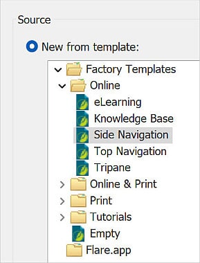
Use a MadCap Side Navigation factory template.
1. Select New Project at the start page or File menu.
2. Select the Side Navigation template:
3. Select Next.
4. The only available target option is HTML5. Select Finish.
Toolbar
You must use the Toolbar skin from the sample project. It contains the custom code you need.
1. Unzip the Show-Hide-TOC-v2.flprjzip file linked here.
2. Copy the Toolbar skin (Toolbar.flskn) from the Show-Hide-TOC project into your own project (Project > Skins folder).
3. Optionally, verify the settings—they are the same as shown in the images below:
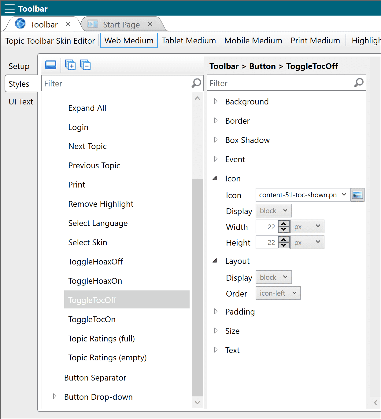
Web Medium: ToggleTocOff —The ToggleTocOff button uses a Display setting of “block” for Icon. The Layout is also set to display as “block.” This is correct.
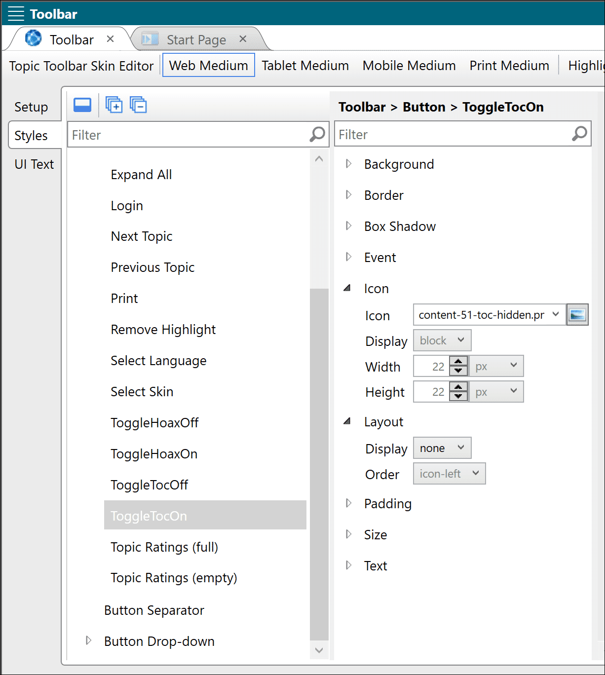
Web Medium: ToggleTocOn—Here the Icon’s setting for Display is “block” and the Layout display is “none.” This is correct.
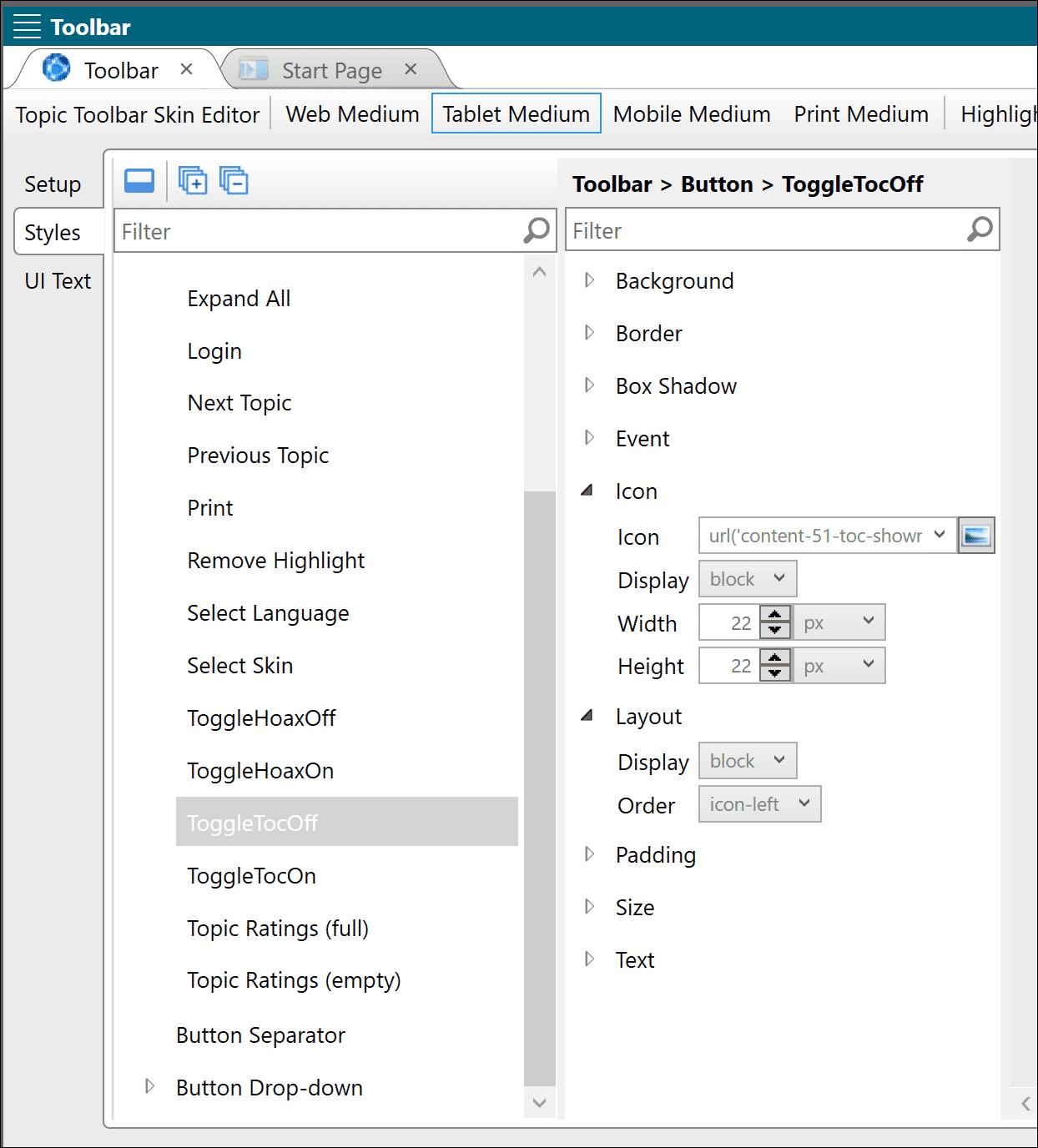
Tablet Medium: ToggleTocOff —The ToggleTocOff button uses a Display setting of “block” for Icon. The Layout is also set to display as “block.” This is correct.
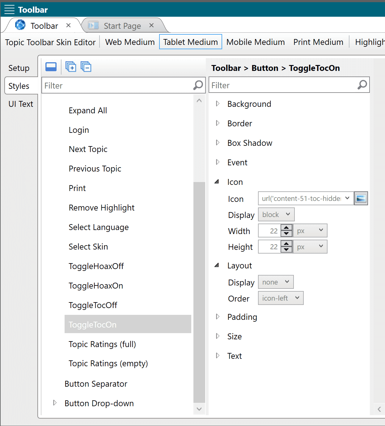
Tablet Medium: ToggleTocOn—The ToggleTocOn button uses a Display setting of “block” for Icon. The Layout is set to display as “none.” This is correct.
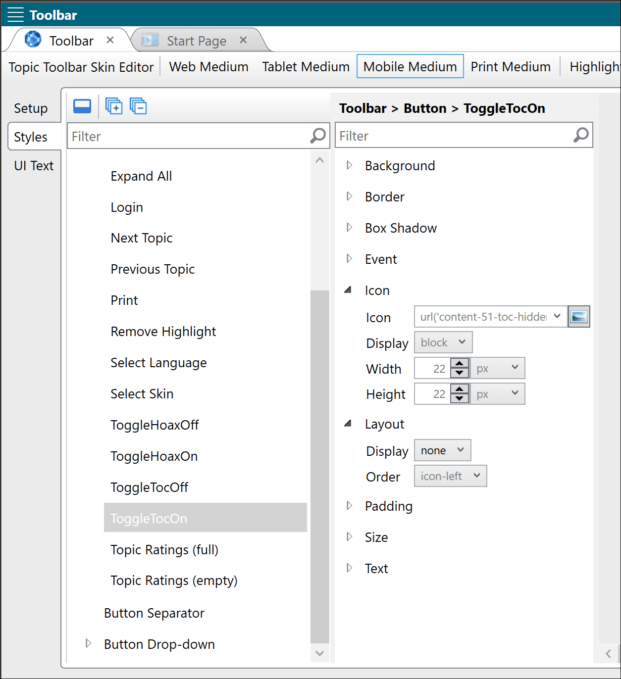
Mobile Medium: ToggleTocOn—The ToggleTocOn button uses a Display setting of “block” for Icon. The Layout is set to display as “none.” This is correct.
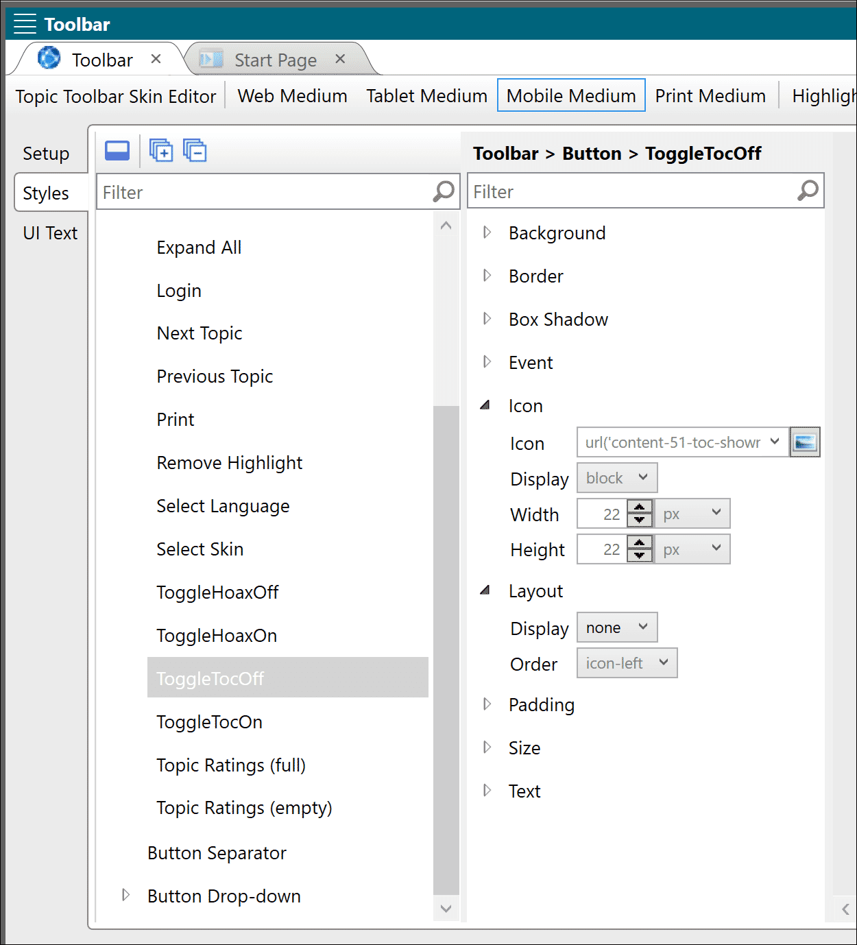
Mobile Medium: ToggleTocOff —The ToggleTocOff button uses a Display setting of “block” for Icon. The Layout is set to display as “none.” This is correct.
4. Close the file.
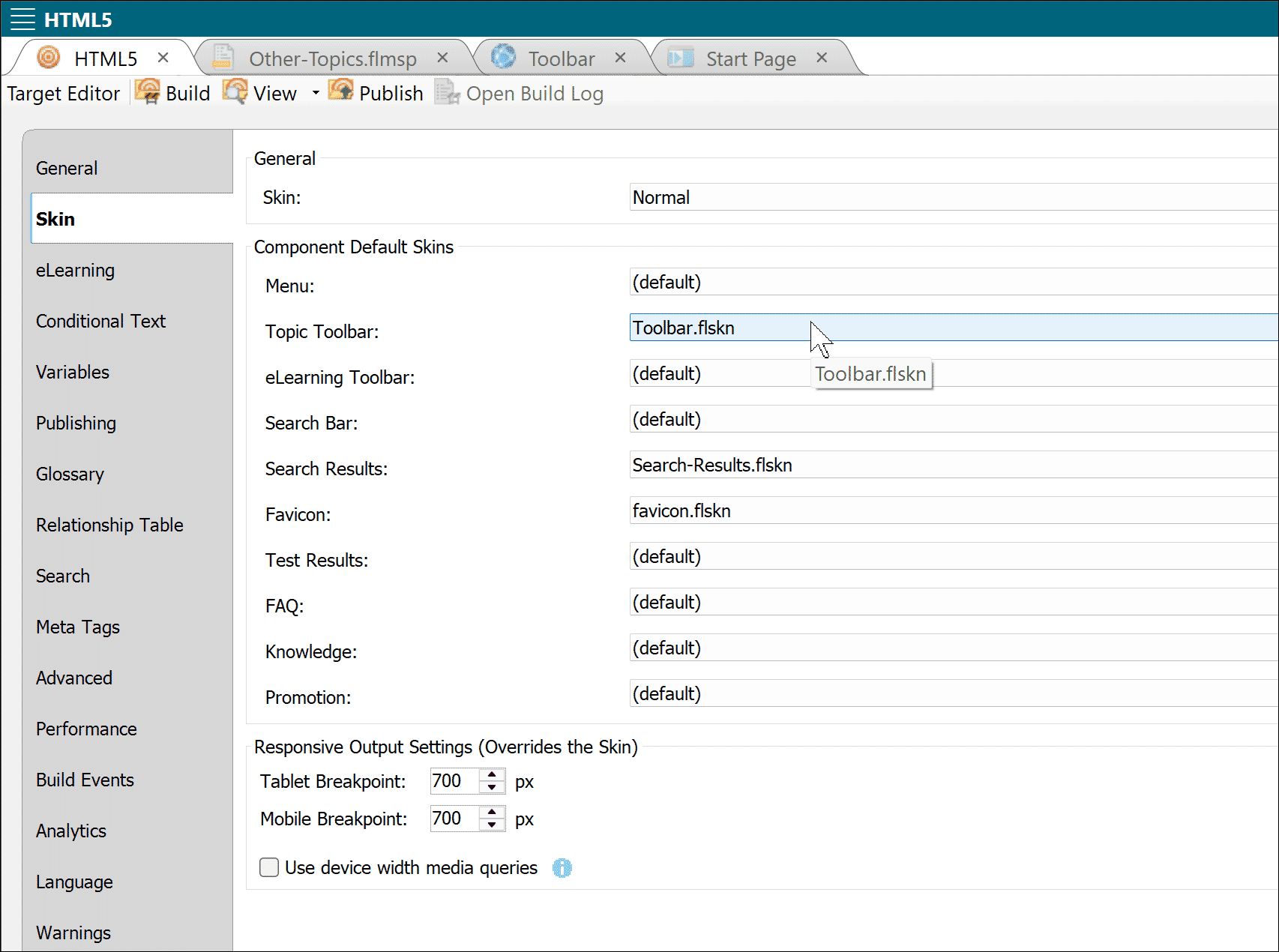
5. Open your target file in the Target Editor, and be sure to select Toolbar as your skin in the Topic Toolbar dropdown:
6. Save and close the target file.
Style Sheet
A text edit to define the buttons is simple and quick.
1. In text mode, copy and paste these lines (taken from the sample style sheet) at the very end of your own style sheet. Be sure to include the background-size statement:
/* Begin BUTTONS for Show/Hide TOC */
button.toggle-hoax-on-button .button-icon,
button.toggle-hoax-off-button .button-icon,
button.toggle-TOC-on-button .button-icon,
button.toggle-TOC-off-button .button-icon {
background-size: 20px !important;
}
/* End BUTTONS for Show/Hide TOC */
/* a bit of voodoo from Dave Lee Nov. 8, 2024:*/
@media tablet
{
.sidenav-wrapper
{
display: none !important;
/* overwrite inline style set by show/hide TOC script, so side nav menu not displayed in tablet */
}
button.toggle-TOC-off-button,
button.toggle-TOC-on-button
{
display: none !important;
/* overwrite inline style set by show/hide TOC script, so toolbar button not displayed in tablet */
}
}
@media mobile
{
.sidenav-wrapper
{
display: none !important;
/* overwrite inline style set by show/hide TOC script, so side nav menu not displayed in mobile */
}
button.toggle-TOC-off-button,
button.toggle-TOC-on-button
{
display: none !important;
/* overwrite inline style set by show/hide TOC script, so toolbar button not displayed in mobile */
}
Note: The last set of statements for @media mobile and @media tablet are a workaround to avoid rewriting the old script; it keeps the PC-style Contents from loading in mobile or tablet mode, respectively.
2. Save and close the file.
Template Page
Add a proxy for the custom toolbar skin to your template page. The sample uses Other-Topics.flmsp (Resources > TemplatePages > Other-Topics.flmsp).
1. Position the cursor at the beginning of the template page file Other-Topics.flmsp and select Insert > Proxy > Topic Toolbar Proxy:

2. It may be possible to use “(default)” in your case, but I always specify the name:
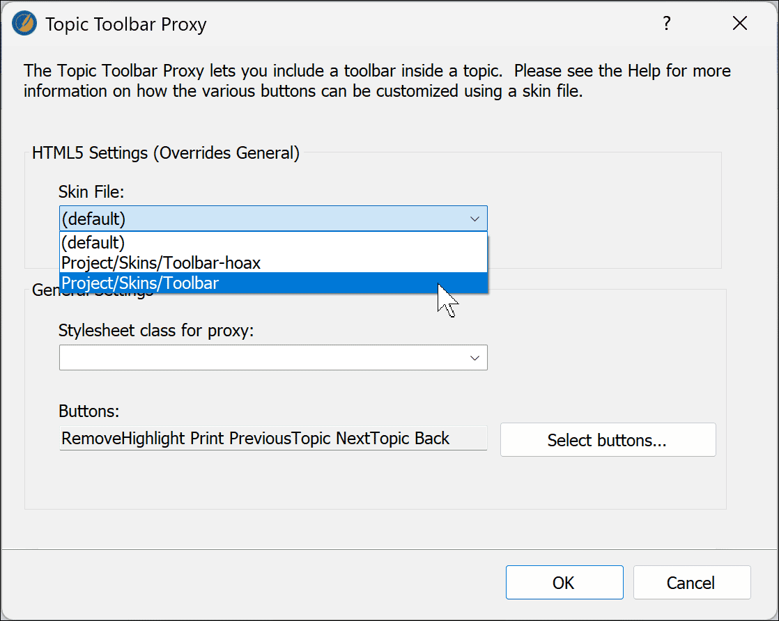
3. You do not need to select or edit the buttons here. Click OK.
4. Save the file. The finished file should look like this in the XML Editor:
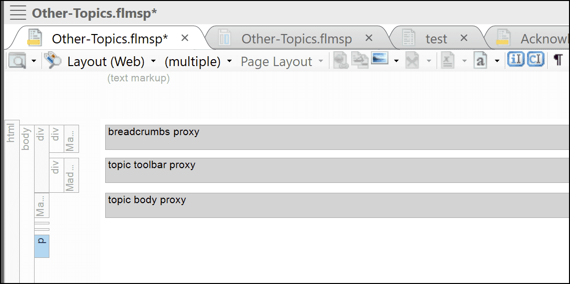
5. Close the file.
Your Choice: Persistence
(All Users)
Unlike the original version linked here, Version 2 by default remembers whether the Contents pane is open or closed. That is, the Contents state is remembered (“persists”) even after the browser is closed. Hide the TOC, close the browser, even turn off the computer, and when you re-open the browser, the TOC will still be hidden, as you specified. That’s because a cookie has been stored on your computer to remember the state. This is called “local storage.”
But if you don’t want that effect, you can change it. The other option is to remember the state only during the current session; close the browser, and the state is forgotten. This is called “session storage.”
To change this behavior, so that the session state is not remembered, you’ll need to edit the <script> section of the toolbar skin in a text editor like Notepad++ or Flare’s own text editor. Note that you cannot use the Skin Editor here; frankly, this is a bit of a hack.
Tip: You can edit files opened in both Flare and another text editor simultaneously. Just be careful which version is saved as final.
To “forget” settings after closing the browser:
- Open the skin named Toolbar.flskn in your text editor.
- Search for localStorage and replace it with sessionStorage.
- Save and close the file.
The session will no longer be remembered. Changed your mind? Reverse your edits.
Project Test
1. Build your HTML5 target and your output should show the TOC Show/Hide icons at any page that uses the Other-Topics template page, i.e., all but the home page in our sample. Remember that the TOC icons will disappear if you shrink the screen size below the Tablet or Mobile breakpoints (not shown here):
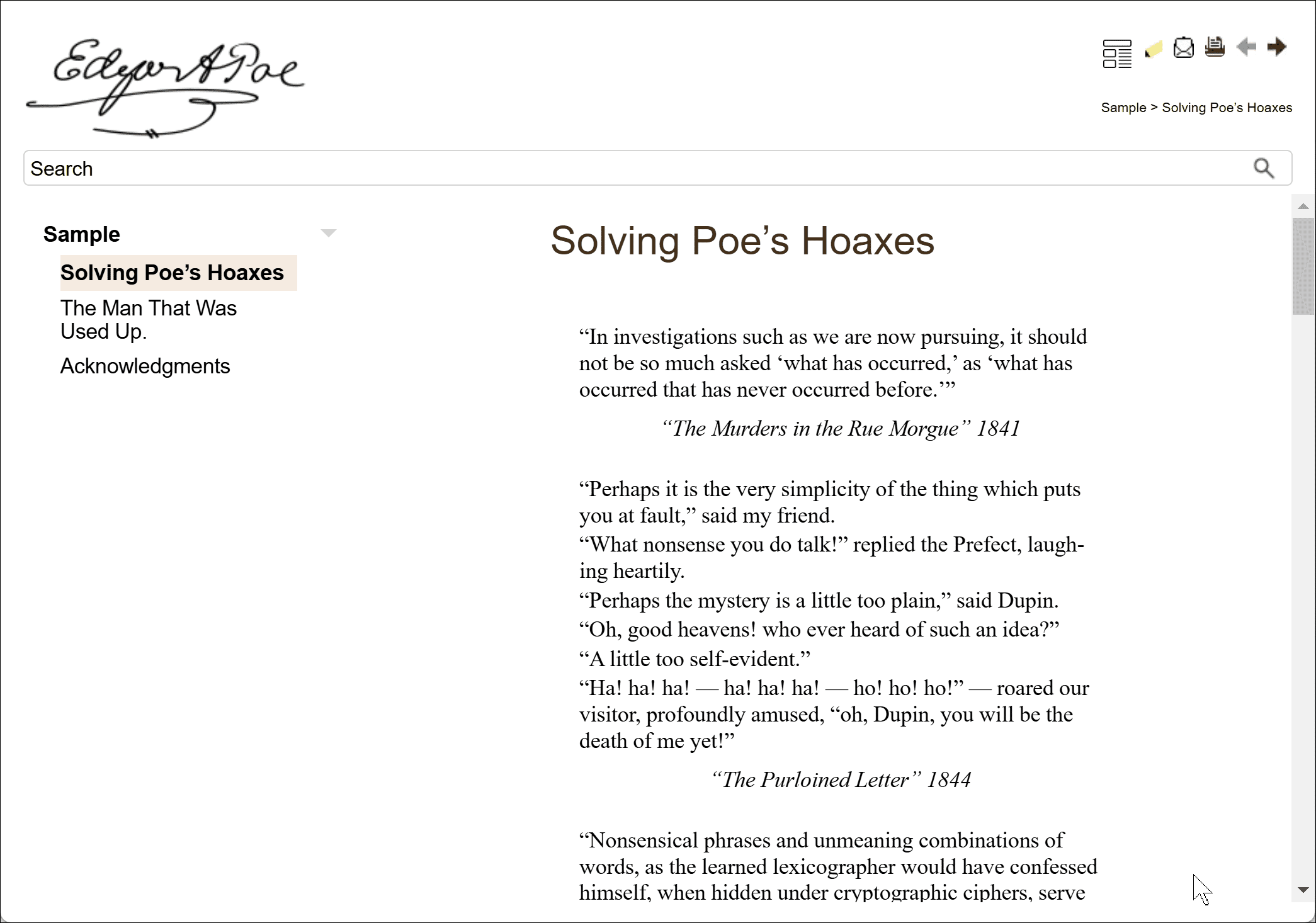
TOC visible.
2. Select the TOC icon once, and the layout changes to:
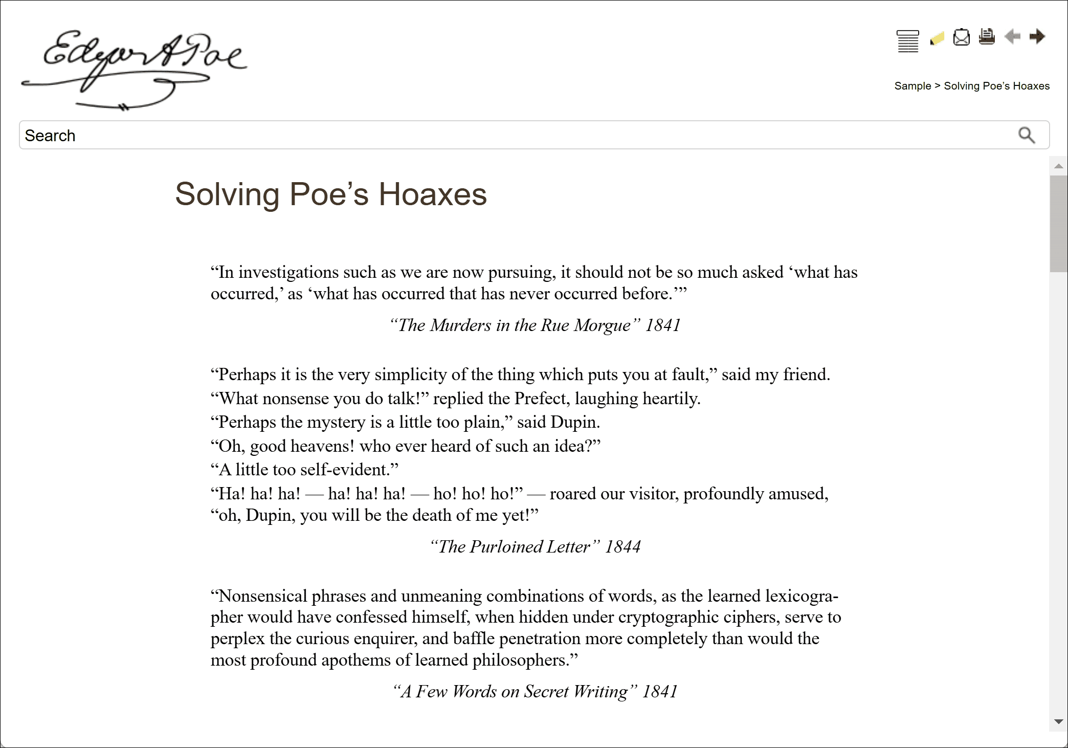
TOC hidden.
It’s fun to switch, and the buttons still never wear out!
