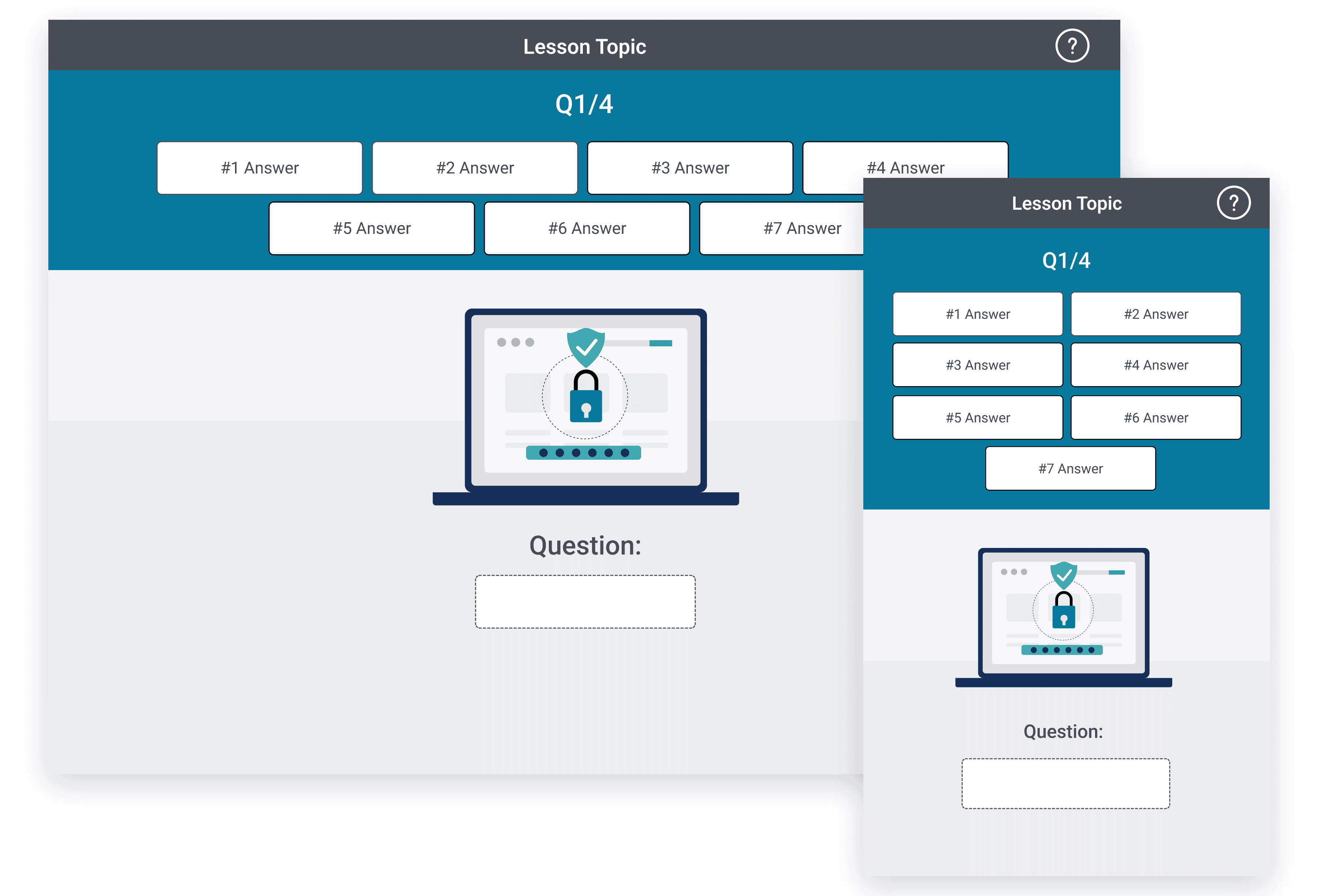
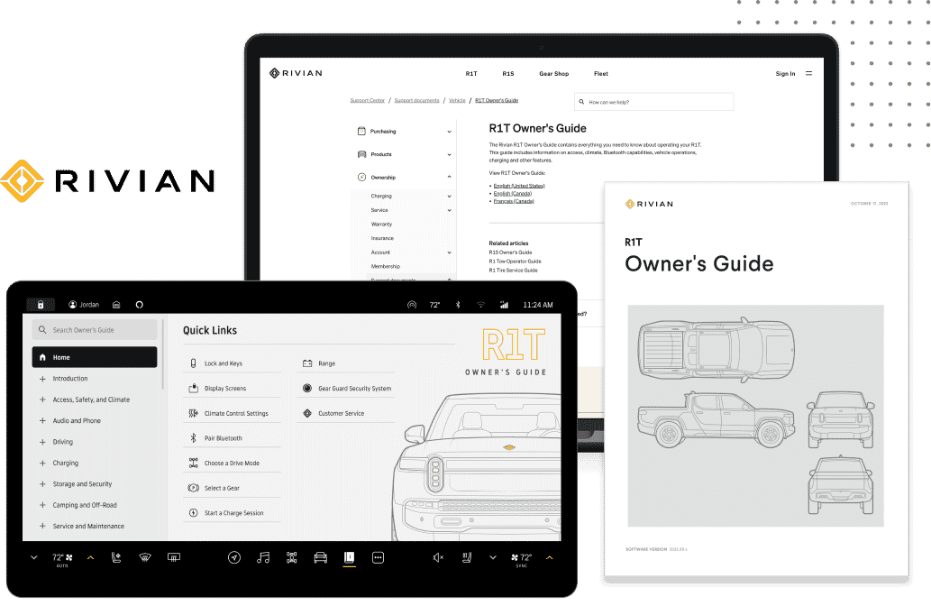
Responsive eLearning design is essential for maximizing learner engagement and ensuring that educational content is accessible across devices. With an increasing reliance on smartphones and tablets, organizations and educators must create responsive eLearning content that adapts seamlessly to any screen size. In this blog, we'll explore what responsive eLearning design is and why it's crucial and share our top design tips and examples to help you create more engaging, accessible, and effective eLearning experiences.
What is Responsive eLearning Design?
Responsive eLearning design involves creating educational content that adjusts to fit various screen sizes and device orientations, from desktops to tablets and smartphones. Unlike fixed layouts, responsive eLearning design automatically adapts to different devices, ensuring a consistent and enjoyable experience for all users.
Responsive design can improve the learning experience by:
- Allowing learners to access content anytime, anywhere
- Providing a consistent user-friendly layout regardless of device
- Enhancing learner engagement and retention by reducing distractions and promoting interaction
- Improving Retention with Bite-Sized Content
- Catering to Different Learning Preferences
Given today’s mobile-first world, responsive eLearning design is more critical than ever.
Why Responsive eLearning Design Matters
eLearning has evolved to meet the demands of a diverse, mobile, and tech-savvy audience. This makes responsive design essential for modern learners. One of the most critical reasons for adopting responsive eLearning design is accessibility. Learners today use a variety of devices to access content, from laptops and desktops to tablets and smartphones. Ensuring that eLearning content adapts seamlessly across different screen sizes significantly enhances accessibility, making it easier for learners, no matter where they are or what device they're using.
Responsive eLearning design also boosts engagement. When content is visually appealing and easy to navigate, learners are more likely to stay engaged and complete their courses. An intuitive, responsive layout reduces friction. This keeps learners focused and motivated as they progress through the material and is important for mobile users, who may have less tolerance for clunky, non-responsive interfaces.
Another benefit of responsive design is the flexibility it provides. Learners can switch between devices as they go about their day, accessing lessons and resources whether they're on a laptop at work, a smartphone during a commute, or a tablet on-site. This flexibility ensures that learning fits seamlessly into their lifestyle, promoting higher engagement and a more user-friendly experience.
Finally, responsive learning design is crucial for future-proofing eLearning content. As technology continues to evolve, a responsive approach ensures that learning materials remain relevant and functional on new devices and screen sizes. By investing in responsive eLearning design, organizations can create content that adapts to the changing technological landscape, providing learners with a consistent and effective experience over time.

6 Ways to Create Great Responsive eLearning Designs
Creating a responsive eLearning course experience that meets the needs of all learners involves thoughtful instructional design choices, technical skills, and a solid understanding of your learners’ needs.
Here are some key strategies to consider:
Tip 1: Choose the Right Authoring Tools
Responsive eLearning content design begins with selecting a flexible authoring tool. Platforms like MadCap Flare, Create, and Syndicate are designed to streamline eLearning development and responsive content creation, allowing for customizable layouts and seamless integration across devices. These tools also enable eLearning designers to incorporate interactive elements, enhancing learner engagement and delivering effective learning experiences.
For example:
- MadCap Flare supports single-source publishing, enabling authors to create content once and publish it across multiple formats, including LMS, while maintaining a responsive layout.
- MadCap Create and Syndicate, in addition to single-sourcing and structured content creation, offer a robust content delivery platform, ensuring that learning modules adapt to different devices and provide real-time analytics to track engagement on each platform.
Using the right tools, such as MadCap Software's content authoring software and content collaboration software, you can simplify the design process, improve team workflows, and ensure a consistent, high-quality learning experience across all platforms.
Tip 2: Prioritize a Mobile-First Approach
Designing with a mobile-first mindset ensures that eLearning content works seamlessly on any device, aligning with universal design principles. Starting with a mobile-focused layout simplifies navigation, using clear menus and touch-friendly buttons for an intuitive experience.
Mobile-first design also supports bite-sized content segments that fit well on small screens. This microlearning approach makes information easier to digest and encourages quick, on-the-go engagement.
By prioritizing mobile users, you can test scalability from the start, ensuring images, text, and interactive elements adapt smoothly to larger screens. This approach avoids the hassle of retrofitting desktop content, resulting in a polished, flexible mobile learning experience accessible across devices.
Tip 3: Focus on Intuitive Navigation
Navigation plays a significant role in how learners interact with content. Responsive eLearning should prioritize simple, intuitive navigation that is easy to use on touchscreens and smaller devices. Well-designed navigation not only improves learner engagement but also ensures a seamless eLearning experience.
Key considerations include:
- Clear, concise menus that collapse into icons or drawers for mobile
- Visible call-to-action buttons that guide learners through each module
- Consistent navigation placement so learners can quickly find and access different sections
By keeping navigation clean and straightforward, you reduce friction and create a smooth, engaging experience.
Tip 4: Optimize Multimedia for Speed and Performance
Multimedia elements like videos, images, and animations enhance engagement but can hinder loading times on mobile devices. Using Flare's multimedia publishing software ensures that these elements are optimized for different screen sizes without sacrificing quality. For instance, breaking longer videos into smaller segments can keep the learning content engaging without compromising speed—essential for maintaining an effective eLearning design.
Here’s how to optimize multimedia for responsive design:
- Use compressed images to reduce file sizes without sacrificing quality
- Limit video length or break content into shorter clips that load more quickly
- Enable video and image scaling so they adapt to different screen sizes
This approach minimizes load times, improves overall performance, and keeps learners focused on the content.
Tip 5: Implement Interactive Elements Thoughtfully
Interactive elements like quizzes, drag-and-drop exercises, and clickable infographics are excellent tools for promoting engagement in eLearning content. To ensure a smooth, responsive experience, it’s essential to consider how these interactive features will perform across different devices.
For mobile users, using touch-friendly controls and larger clickable areas is key. This approach prioritizes eLearning localization, making it easier to navigate on smaller screens and minimizes accidental clicks. Interactive activities should also be designed to adjust fluidly as screen size and orientation change, maintaining functionality and visual clarity.
Choosing lightweight, mobile-optimized elements is important for performance, as it allows interactivity without slowing down the user experience. Well-placed interactive features can create a truly immersive learning environment, helping learners retain knowledge more effectively.
Tip 6: Test Across Multiple Devices and Screen Sizes
Testing is crucial for effective responsive eLearning design. Ensure that your courses look and function as intended on different devices by testing across a range of screen sizes and orientations. Also, ensure compatibility across different operating systems and browsers. If you do not support a particular one, make sure it is stated clearly before the learner encounters the issues. Thorough testing ensures that your instructional materials and learning technologies meet the highest standards, providing an excellent user experience rather than a frustrating one.
During testing, pay attention to:
- Readability: Ensure that fonts, colors, and spacing are accessible and consistent.
- Functionality: Test each interactive element to confirm it works seamlessly.
- Load Time: Monitor load times to guarantee quick access for all users.
Regular testing allows you to identify and fix issues before learners access the content, creating a smoother experience.

Examples of Responsive eLearning Design
For organizations looking to provide a seamless and engaging learning experience, MadCap Flare and Create learning content management system offer robust solutions designed specifically for responsive eLearning design. These tools allow organizations to create adaptable, multimedia-rich content that looks great and functions effectively across all devices—whether learners are on desktops, tablets, or smartphones.
MadCap Flare is particularly powerful for smaller eLearning teams who value flexibility in content creation. With Flare’s single-source publishing, users can create content once and publish it across multiple formats and devices without needing to adjust for each screen size. This single-source approach not only reduces the time and effort required to make content responsive but also ensures consistency across all platforms. Flare’s responsive output automatically adapts to various screen sizes, rearranging and resizing elements to fit neatly, which enhances accessibility and user experience. The built-in support for multimedia elements such as videos, quizzes, and interactive infographics enables organizations to deliver a highly engaging eLearning experience that’s tailored to diverse learning preferences.
Create extends responsive design capabilities with a strong focus on large-scale content management. Like Flare, Create supports single-source publishing, which allows learning content to be developed once and deployed across multiple channels and devices with ease. This capability is especially valuable for enterprises and institutions managing vast amounts of learning content for various audiences. MadCap Create and Syndicate also offers advanced tracking and analytics, providing insights into how learners interact with the content. These analytics empower organizations to continually refine and optimize their eLearning programs based on actual usage and performance data, ensuring a personalized and effective learning experience over time.
Both MadCap Flare and Create exemplify how responsive design tools can create cohesive, adaptable learning content that enhances engagement and accessibility. These platforms not only help organizations design high-quality, responsive eLearning content but also provide the infrastructure to manage and analyze content on an ongoing basis, making them excellent choices for organizations committed to delivering impactful learning experiences in a mobile-first world.
Bringing it All Together: The Importance of Responsive eLearning Design
Creating responsive eLearning content not only enhances the user experience but also drives higher engagement and better learning outcomes. With the proliferation of mobile devices, learners expect content that is accessible, convenient, and consistent, no matter how they choose to access it. By following these tips—choosing the right tools, focusing on mobile-first design, simplifying navigation, optimizing multimedia, incorporating interactivity, and thorough testing—you can deliver responsive eLearning experiences that cater to diverse learning needs.
Responsive eLearning design is a powerful way to ensure your educational content reaches learners wherever they are, on any device. By investing in responsive design principles, you empower learners to engage fully with the material, increasing satisfaction and boosting knowledge retention. The right tools, strategies, and best practices make it possible to create immersive and effective eLearning modules that adapt seamlessly, transforming learning into a more flexible and accessible experience.
To start building responsive eLearning courses, explore tools like MadCap Flare, Create and Syndicate, which are built for flexibility and offer extensive support for multi-device learning. Ready to elevate your eLearning design? Implement these tips today and take a step toward a more responsive, engaging, and impactful learning experience.


