In addition to the new features reviewed in part one of this series, micro content and variables received updates and enhancements including:
- Micro content styles
- Styled Variables
Micro Content Styles
New in Flare 2020 r2, is the ability to customize how micro content looks in search results and as embedded help, versus how the source content looks in the topic. For example, if you are tagging a stepped procedure from your topic as micro content, you may want less spacing between list items, a different font or font color, or maybe some content between the list items hidden. If you are using micro content for embedded or field-level help, you may have less real estate to display the content, so adding this additional level of single sourcing power is a great option.
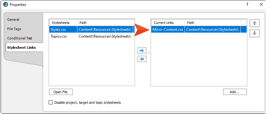
Right-clicking on a micro content file will bring up the properties of that file, where you can associate the micro content file with a particular stylesheet.

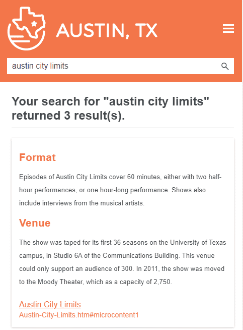
In this example, “Micro-Content.css” has styles defined for how certain elements should look, like color, spacing and font size for h2 and p tags when micro content is displayed as featured snippets in search, or as embedded help.
In the output, the featured snippet in search looks like this:

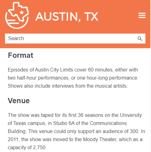
Clicking on the topic link will show that same content in the topic, however, it will look like this:

Prior to this release, this could be accomplished using advanced (complex) selectors, and this can still be done. However, this approach using complex selectors only works for featured snippets in search, and not for embedded (context-sensitive) help calls to micro content. A certain comfort level with creating and managing complex selectors in the style sheet is also required.
|
Method 1: Separate Micro Content Stylesheet |
Method 2: Advanced Selectors |
|---|---|
|
Works for all kinds of micro content (featured snippets in search results, context-sensitive Help calls, etc.) |
Works only for micro content displayed as featured snippets in search results |
|
Requires multiple stylesheets |
Can be done in one stylesheet |
|
Most likely easiest for many users |
Users must know enough about CSS to create advanced selectors |
For more information about using this approach and information on stylesheet precedence, visit this topic in the online Help.
Styled Variables
Variables are a great way to control short strings of text used over and over. They can be a huge time saver when it comes to updating things like product names, version numbers, company names and more. Think about any short string of text that you use over and over again in your content that may change in the future. This is a perfect use case for a variable. Previously, variables were unformatted bits of information, leaving them to inherit the formatting of the element where they are inserted. Flare 2020 r2 now makes it easy to style the way a variable looks in the XML editor, and in the generated output.
The MadCap|variable element can be edited in the style sheet, to achieve the look you want. You can edit the root MadCap|variable style to affect all variables or you can add a style class that would affect only the variables where you have applied that class.

Using a styled variable may look like this:


More information about styling variables can be found in this topic in the online Help.
Up next in this series, we will review the new enhancements to MadCap Connect for Salesforce®, MadCap Connect for Zendesk®, target file features, and more. Plus, join us for a live webinar where we will review all these new enhancements in MadCap Flare 2020 r2.


