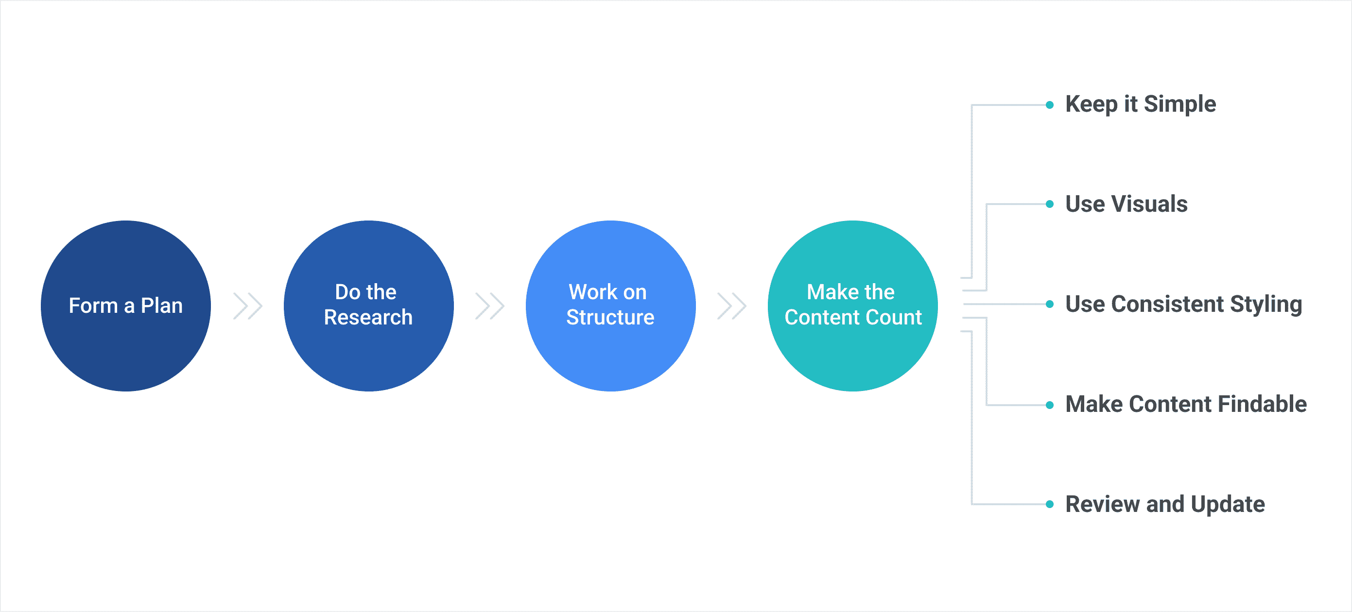
Writing a user guide is like training a puppy, right? Uh, no, not really. A puppy is an energetic life-force to be reckoned with, while the prospect of plodding away on a user guide might be as exciting as watching a marine sponge grow. Funny enough, the contrasting acts of rearing a puppy and writing a user guide relate in that each one has its own set of fundamental steps that most people follow for successfully completing the task. By delving into the basics for doing each task, they become equally enjoyable in their own way. Both have need of a plan, research, structure, and action.
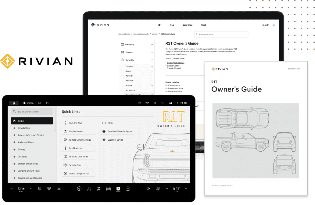
Today, let us focus on how to write a user guide for software and why it is important—I promise there will be less biting, nipping, and chewing involved. A user guide is a resource that tells people about software (or hardware) so they can use the product or service correctly and effectively. A user guide can assume different formats such as a printed book, online PDF document, or HTML5 website. You can organize and design the user guide in a unique and modern way to fit the needs of your audience. All too often, people avoid reading or even looking at a user guide. There are businesses that view technical documentation as a low value task and do not give it proper attention. So, why do you need to write a user guide?
If a user guide proves to be a reliable resource, it instills a positive impression, especially when starting out or working through a problem. Customers may gain peace of mind that they have invested in a worthwhile product or service that cares about the details that matter to them—making them more apt to spread the word of how wonderful it is. Not only do user guides help people make full use of a product, but they can help train internal users, be a reference for employees, reduce the number of calls to customer service, improve product quality or company image, and serve as a marketing tool. If there is vitality for writing a user guide and certainly for the content, the author(s), business, and customers tend to feel it. The user guide then holds higher value and becomes an essential part of the user experience. Unless you want your customers to flounder, it is highly recommended to create a guide.
A user guide is beneficial, but how do you write one that has a better chance of staying on a desktop rather than ending up in the trash bin? Since the goal of a software user guide is to help users figure out how to install, use, navigate, and troubleshoot an application with ease and without frustration—and sometimes software can be complex—it makes sense that a well-crafted guide should be clear, easy-to-read, informative, and useful. But it should also be comprehensive, accessible, and engaging.

There is no one way to do it, but it may be helpful to start out methodically. Just like if you introduce a puppy into your life, you first think about it. You do research, you organize the details, and then you commit yourself to the new pet and have fun. Use the same type of logic when getting started with writing a guide.
Step 1: Form a Plan
The first order of business when getting started writing a user guide, is to plan it. If you take time to think about the following questions attacking the task should unfold.
- What do users need to know or do?
The answer should point to the purpose of your user guide. The more specific and thorough you are in answering this question, the more useful your guide will be. Try to put yourself in your customers’ position to understand their needs. Here are some other questions you might ask. Are there over-arching concepts to explain? What are the workflows that you need to take them through? Are there step-by-step instructions involved? Is there a user interface to display? Are there specific requirements, frequently asked questions, or key features to troubleshoot? Are there warnings and precautions? Are there other resources?
- Who is the target audience?
When you identify who will be reading or using the guide, you can pin-point how to effectively communicate to that specific group of people. Evaluate their skill-level, education, concerns, needs, preferences, age, language, accessibility, etc. Also, figure out the most efficient way your users will open the guide. You want the user guide to appeal to your audience. Using the right words and tone in the text enables users to connect with the message better. For example, consider the difference in writing between a user guide designed for teenagers about a gaming software application, and a user guide for an engineer on how to integrate software with an aviation unit.
In planning a user guide the purpose of it should match the needs and knowledge base of the audience. Once you uncover what your audience needs to know or do, and who they are, this puts you in a better position for deciding the scope of the user guide. The components you put in the user guide depend on the purpose, user needs, and how the user intends to access the information.
Step 2: Do the Research
Have you ever run into trouble with a product, and then it does not take long after opening the user guide where your vision blurs with confusion, you scratch your forehead, and think this technical document is totally useless? This is a common experience. The usual culprits are you cannot find what you are looking for, there are spelling and grammar mistakes, the translation is poor, it is dry and boring, or the information is wrong.
Because of the preparation work, you should have a sense as to what information to include and how much of it, and how to deliver it. So, we start to drill down even further into the process. The good guides are seamless and painless for readers. One of the best practices to ensure a great user guide experience is to spend time doing research. The better you understand a subject yourself as the technical writer, the more clearly and succinctly you can write about it for others.
The research phase means gathering all the information about the subject as possible. This can include conducting interviews with subject matter experts, observing the process, getting to know customer pain points, exploring the web, and using the software (i.e., product or service) to learn it for yourself. Get your hands dirty with that puppy!
Step 3: Work on Structure
The structure of the user guide is its organization. You should outline the content in a practical way for the material and for the target audience, keeping both their needs and your resources in mind.
Note that a user guide can be in various forms. For instance, a printed book, PDF, online HTML website, knowledge base, reference sheets, information graphics, tutorials, videos, etc. Printed or online user guides typically include a cover or home page, copyright and contact information, table of contents, chapters or topics, procedural steps, troubleshooting section, glossary of terms, and an index.
The content should have a logical flow to it in whatever medium you use. The arrangement of content plays a role in how effectively you communicate ideas and how easy that information is to find. Use elements such as headings, sub-headings, or lists to present text in a hierarchical order. Place information of importance on top. Does it make sense to arrange the content in chronological order, in a sequence of events, as problems and solutions? Does it make sense to present it as one long book, or in smaller chunks of topic-based content? To help with flow you might consider using a template to stick to a decided upon structure.
Step 4: Make the Content Count
It is time to write. You know what to write and who the audience is, but how do you make the content come to life for your reader? Start by making a simple outline and a draft. Remember, the user guide is to tell your audience what they need to know or how to do something. When it comes to technical writing, the amount of content does not matter, but content of high-quality is a superpower. It can empower your readers. They should be able to master any issues that arise with the ninja-style skills and knowledge that you provide—quickly and effortlessly. The following best practices can help make a user guide shine.
- Keep it simple.
Although you know your audience, you should not assume they know anything about your product or service. You want an easy-to-read, clearly written user guide with an understandable message—affecting them the first time they read it. Create content using plain language. Write engaging, error-free text in the active voice, and keep step-by-step instructions brief but thorough. Be sure to stay on topic using straightforward words.
- Use visuals.
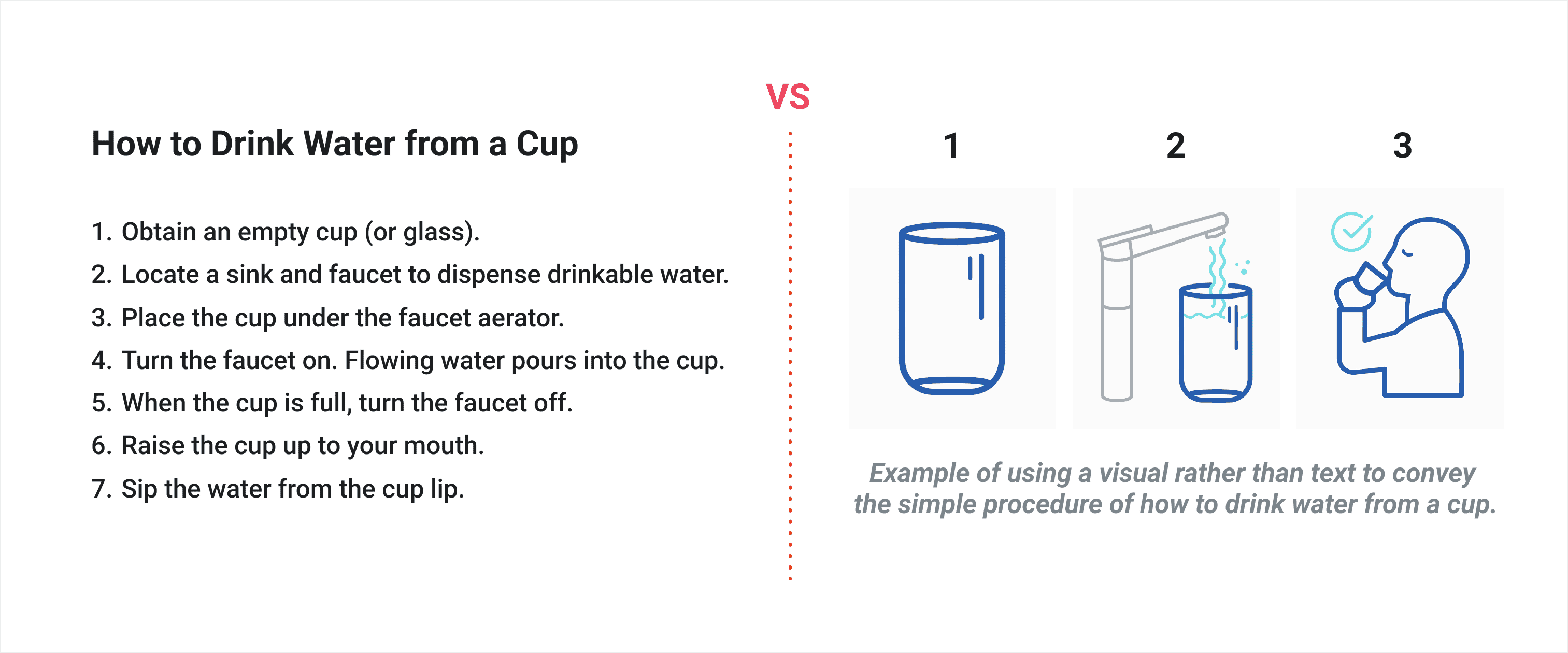
You have heard the adage, “a picture is worth a thousand words.” That is surely applicable for a user guide. Why say something when you can show it in a simpler form? The use of graphics, screenshots, tables, diagrams, illustrations, maps, or videos promotes a friendly, user-centered message and design.
- Use consistent styling.
It is good practice to format a user guide for readability. That is sticking to the structure, banding the flow of content with navigation and links, and using the same styles throughout the guide. Consult with your company’s content style guide. If you standardized writing, tone, and layout for example, the material appears unified with other company publications. It will look and read better. If a style guide is not available, create one or use a known editorial guide (e.g., AP Stylebook, or Chicago Manual of Style). A content style guide is an invaluable tool for a company, and a branding style guide is also helpful for design elements.
- Make content findable.
No matter how well you write something if the reader cannot find it—it is useless. First, the user guide needs to be easily available so one can reference it. Second, it needs to be accessible for those with disabilities. And third, the content must be searchable. User guides are seldomly read from beginning to end. Most people open it and search for a certain topic or action to do. For printed work, use components like a table of contents, index, and glossary. For online user guides use elements such as search, keywords, synonyms, context-sensitive Help, analytics, and cross-reference links.
- Review and update.
Revising content is a huge part of making content count. Look it over and have others inside and outside of your department look at it too. It is essential to make sure the content in a user guide is correct and current—otherwise, it is useless. Proofread, edit, and test it. Can you find information? Does it read well? Does it have impact? Does it achieve its purpose?

Summary
The thought of writing a software user guide can be daunting, but it is doable with a methodical approach (and a bit of creativity). It takes planning, researching, structuring, and actively writing it all out. The main idea is to draft a user guide consisting of quality content that is easy-to-read, informative, and useful. You want it to add value to the overall user experience.
It is a good thing we left the subject of how to deal with a puppy for another blog post. In the same way as training a well-behaved puppy, a well-written user guide takes patience, persistence, and effort. If done well, readers should have at their fingertips, a user guide to count on through the life of their software product or service—just like the ultimate companion dog.


