This guest blog post was written by Diane B. Hogan, PhD, Technical Communications Specialist at ReDactions.
This article analyzes how technical writers approach content development. It highlights how MadCap Flare is different from other content authoring and technical documentation solutions, speaking to its many benefits, such as topic-based authoring, content reuse, and scalability.
About the Author
I have been developing software documentation since 2006, first using Word, and then in 2012, our team converted content to MadCap Flare. However, my experience with software started in 1977 as a software developer on the mainframe. Over the years, I have transitioned from software development to mainframe security, instructor-led training (mainframe security), and instructional design.
Working with clients was most rewarding when I could teach them what the software does and how to harness its power to make them successful. As my sixth-grade teacher suggested, I did become a teacher – but not in the traditional sense! Along the way, I have studied instructional design, technical communication, document design, and learning theory.
Rather than bore you with scholarly citations, some of this content draws from my dissertation, Learning and Doing Through Software Documentation.
How Do Users React to Your Help?
When users reference your online Help system, how do you think they react?
- Is content findable?
- Is it usable?
- Are procedures easily recognizable?
- Are topics formatted consistently?
- Does it help the user perform a task?
- Does it convey concepts and provide background information?
I address these issues and more in this article.
Reading To Do and Reading To Learn
Learning and doing are the primary objectives of the users of technical documentation – as they read to do and read to learn. Users want to learn from what you write. As technical writers, we create meaning out of complex contexts and transform declarative knowledge into procedural knowledge.
Reading is one of the most heavily researched of all human cognitive behaviors. Reading involves perception, recognition, encoding, storing, and retrieving information from memory, and complex forms of reasoning and problem-solving. Therefore, it is logical to expect that good technical documentation development is based on theory, a theory that supports the cognitive processing of technical information.
Theory and Practice
What is technical writing? How do you become a technical writer? Let's review a bit of theory before we get into actual technical writing. I realize that discussing theory may be a turn-off for some. However, I think it is essential to look at the why before we get into the how. You may be surprised to learn that much of what you do as a technical writer or technical communicator is based on theory.
Technical Communication is Multi-disciplinary
The field of technical communication pulls, draws, and borrows from other disciplines. Its broad perspective includes awareness of interface design, information design, instructional design, and usability.
The common theme is a user-centered focus in design and development across instructional design, information design, and usability. Each discipline considers user needs from a slightly different perspective:
- Instructional designers must know the target audience and the specific learner knowledge base and characteristics.
- Usability experts consider the ease of use of interface designs.
- Information designers consider the document's overall visual rendering to attract the reader, maintain the reader's interest through the context of use, and solve a problem.
- Technical communication is about conveying information that helps the user accomplish a task by presenting contextually relevant information.
In my experience, it helps to know my intended audience, understand usability, consider design, and last but not least, strive toward solving a problem. Now let's proceed on how to write effective technical documentation.
View Writing Through a Problem-solving Lens
To understand how people interact with information, a tech writer must address the problem space, design space, and user's goal space, including learning. It is not enough to create content and transfer information; information must be communicated. Technical writers must view writing through a problem-solving lens.
Design
I am a strong advocate of meshing content with the design, and any design lives and dies by the content it has to impart. The design part of our discipline includes how we use fonts, color, aesthetics, images, and balance. My goal is to make users want to return to the Help system. Their first visit is your opportunity to wow them so that they will return multiple times. This is where digging into CSS (Cascading Style Sheets) can help you design a Help system that wows. You may want to take some time to view the free MadCap Software tutorials and webinars, which is how I jumped into the world of CSS.
Cognitive Load
The multi-disciplinary nature of technical communication includes its connection to cognitive psychology, which encompasses learning theory. While developing good documentation, I consider how much information or technical content is just enough for the user to receive, learn, and take action.
Chunking
Cognitive processing occurs in working memory, and the amount of information that is received has a direct effect on the learning process. Studies show that working memory capacity is anywhere from two to nine items, and some practitioners like to stay at a max of seven. You may be familiar with the phrase "seven plus or minus two."
You can increase the number of items by combining information, a process known as chunking. Chunking reduces the cognitive load on working memory, which can improve retention. With this in mind, you may want to consider how to group procedures. Imagine documenting a wizard that takes users through multiple steps, and within the primary steps, there are sub-steps. Use chunking to help the user work through the parent and child steps. Additionally, try to break up text with meaningful subheadings. Readers constantly scan content. The added white space gives the user a break and makes the information memorable.
Cognitive Load and Document Design
Visual effectiveness and usable information are natural elements of effective document design in technical writing. Technical content should focus on the user, fully explain the action required, and identify how they will interact with the application. Your objective is to narrow the gulf of execution:
- Use meaningful graphics.
- Use visual elements for emphasis.
- Balance the number and placement of visual elements.
- Use visual cues to help users find what they need.
Now to the Writing Part
When tasked with writing documentation for new product features, it is essential to understand how the feature improves workflow. How does the feature help users do their job?
- Does the enhancement save time?
- Does it automate tasks or streamline a process?
- How does this feature relate to processes or workflows?
As a user, I appreciate understanding how all the dots connect. For me, it is not enough to see the steps. I like to know how it all relates so that I can make better decisions about using the product. It's also important to add context to the content – why do we care about this – and then document how to accomplish a task.
Next, let's discuss how we apply these concepts to manage our content using Flare.
Topic-based Authoring
Flare is a topic-based authoring solution. Therefore, we develop content in smaller chunks versus linearly as in Word. A topic-based approach provides flexibility when relocating and reusing content.
Adding a topic is easy, and the fun part is figuring where to hang it. Some writers use a naming convention and locate all the topics directly from the Content folder. My preference is to create sub-folders, grouping topics specific to a feature. This approach makes it easy for the technical writer and the subject matter expert to find topics as the software project grows. If you initially add the topic in one place and then decide to move it, no problem. Moving topics is easy within Flare using a simple drag. And, Flare prompts you to update links to prevent broken links between topics.
Don't forget to follow a standard for filenames. It's easy to lose sight of this detail, but the naming convention is essential and a good documentation practice. I follow MadCap Software's recommendation for file naming conventions:
- Use hyphens to provide visible separation, which is good for SEO optimization.
- Do not use spaces, underscores, or periods.
- Limit the length.
Developing Content
How much content should be in a topic?
The answer depends on how you structure the content. Initially, I develop all the content into a single topic and then step back to analyze how the user might engage. My preference when reading a web page is to read with minimal scrolling. The more I scroll, the more I wonder when will this end? A technical document with extended topics that require scrolling may frustrate your users.
Mini-TOC Proxy
As I analyze my developed content for my intended audience, I determine natural places to split the topic into smaller ones. Let's say that I have a parent topic that introduces the process. I then develop content for each of the major steps as separate topics. For example, suppose you are writing a process documentation with five major steps: Step 1 Initial, Step 2 Content, Step 3 Addresses, Step 4 Conditions, and Step 5 Attachments. The parent topic provides context. The child topics address each major step.
After the child topics are complete, I circle back to the parent topic of my process documentation and add a Mini-TOC proxy. A Mini-TOC proxy generates a link to the child topics. A Mini-TOC proxy inserts the cross-references based on the parent-child structure. As content grows or shrinks, the proxy addresses the changes automatically. Additionally, adding a Mini-TOC proxy to a parent topic provides visual cues to the reader that more follows.
Cross-references
If you decide to split long topics into smaller ones, you need to consider how to provide cues to the user that more content follows. Rather than use a Mini-TOC proxy, you can insert cross-references to guide users from Step1 to Step 2 and so on. It's vital to provide road signs from Topic A (the parent) to Topic B, and Topic C. Nothing is more frustrating in a user manual than learning that users cannot get through a long process because they are unaware that additional topics complete the documentation workflow. So it would help if you use cross-references with some guiding lights, such as Continue to Step 2, using a cross-reference link on the text Step 2.
Expanding Text
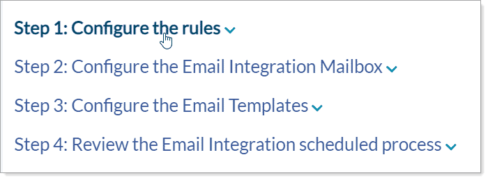
Another approach in the technical writing process is to use expanding text, which presents a hotspot to expand and collapse content. With expanding text, the user stays on the same topic, which minimizes scrolling and clicking. This approach is beneficial when you need to show major steps and where each step is a separate procedure. In our example of Step 1, Step 2, Step 3, Step 4, and Step 5, let's assign each step heading the h2 style. On the h2 is where you insert the expanding text feature. When the user clicks the hotspot, it displays the procedure for that step. The expanding text approach keeps the user in a single topic, provides an overview (Step 1, Step 2, etc.), and gives the user control to expand and collapse the steps as needed.
Snippets: Write Once and Use Many
As your Help system grows, you may begin to recognize topics with repeated content. Perhaps you have seen this content before and ask yourself, is it consistent across the Help? What about when the product changes and the repeated content needs to be updated?
The answer is Snippets. A snippet is a chunk of content that can include text, tables, and images. To create a snippet, select the adjacent parts of the topic with the common content. In the Home ribbon, select Create Snippet. When you need to use the content, insert the snippet. When the snippet content is updated, the changes are automatically applied everywhere it is referenced in a tech documentation.
Variables: Define Once and Use Many
Use Flare's VariableSets to define things such as company and product names. Define once and use many. When the product name changes in a product documentation, you edit the definition, and all instances are automatically updated. Many of us have experienced the pain of name changes. Using variables eliminates the tedious task of copy/paste or replace next/all.
Follow a Standard Format
As I develop content, I use a standard format so that my Help system has a consistent and cohesive look and feel. Users like consistency, and I think it is essential to provide visual cues. Using a consistent approach keeps the noise (clutter) on the page to a minimum.
When you think about our primary objective as technical writers - would you agree that the goal is to make the user comfortable as they move through steps? I like to provide markers to help the user map the overall process of a complex procedure. And good standards and best practices can lay the foundation for developing usable and responsive content.
Style Content to Cue the Reader
It is difficult to ignore the power of CSS when designing the look and feel of the content. Flare's stylesheet editor makes it easy for the tech writer to navigate CSS, even for the novice. I style unique content such as tables, UX elements, and cues to alert the reader that a procedure follows. My style for introducing procedures is named p.ProcedureIntro. It is based on the p selector, with a bit more space before to help separate it from the previous paragraph.
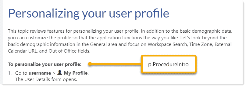
Table Styles and Flare's TableStyle Editor
Another approach to cueing the reader is through table styles. I use two styles, one for showing relationships and one for procedures. Flare makes it easy to design table styles using the TableStyle Editor. You can define margins, borders, and cell spacing, font, headers, footers, columns, and rows. You can do all this without delving into CSS.
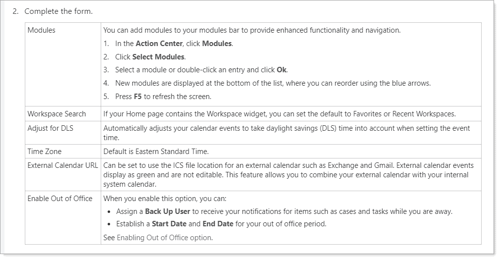
I use my custom table style Procedure.css to document fields, values, and descriptions within procedures. Users can quickly scan the left column looking for field names and learn more about the field in the adjacent column. This style is intentionally designed to mesh with the page and not overwhelm the user. I only bold UX elements, another tip to reduce noise on the page.
Thumbnail Styles for Large Images
In my quest to reduce noise on a page, I use thumbnail images. I try only to use screenshots when it adds value. And yes, this is a balancing act! When is it just enough, and when is it too much? When inserting a large screenshot, I apply a thumbnail style to reduce the image size, maintaining the valuable real estate. This approach lets the user decide when to view the image, giving the user more control of the experience.
Visual Cues
When developing procedures, I am mindful of how many elements I place on the page. If I add a screenshot, then using the img.thumbnail style helps maintain balance. And when I document fields on a form, the Procedure.css table style adds another visual element. Too many elements on a page can overwhelm the reader. Look at this from another perspective – the most important piece of information should be the most prominent. Therefore, when I need to drop a table in a procedure, my table style must not overwhelm the user if there are other visual elements on the page.
Parallelism and Flare's Lists
I recently listened to multiple short videos by Mignon Fogarty (Grammar Girl). One of her tips includes parallelism. Parallelism provides patterns and order, which is a great strategy to help the user with cognitive load. For unordered lists, you might use words that start with ing, showing action: Working, Emailing, Navigating, Reviewing, and so on.
And speaking of lists, a best practice is to use Flare's built-in lists, which are in the Home ribbon. Flare provides styles for ordered, unordered, and definition lists. These are HTML lists (<ul>, <ol>, and <dl>) with CSS list properties. I like to use the built-in list styles because they are easily accessible and quick to find.
Active Voice
Another of Mignon's tips is using active voice. Active sentences improve reader comprehension. This is another excellent strategy to enhance cognitive load. Do you see a pattern here? Mignon's helpful tip is if you can add the phrase "by zombies" to the end of the sentence, then that is a sign of a passive sentence. Passive example: The dogs were fed by zombies. Active example: Zombies fed the dogs.
Enhance Search Results With Micro Content
Have you used Flare's Micro Content feature? When you tag content as Micro Content, the Search results can wow your users. Micro Content is another good example of writing once and using many because you tag existing content. And the results can significantly enhance the user experience. Users want to find answers quickly. Content tagged as Micro Content is short, concise information that is easily consumed. This may be all users need without opening the topic.
Summary
I enjoy writing and maintaining technical documentation because I can apply my sense of creativity, design, and writing skills while being mindful of the constant challenge of not overwhelming the user. MadCap Flare makes my job more fun and manageable when I use Snippets, Variables, Table Styles, Cross-References, Micro Content, and so much more! Flare's rich features add value to what we do.
Additionally, MadCap Central is centralized document management platform where you can store, organize, and manage all your documentation files. Say goodbye to scattered files and version control issues. With MadCap Central, you can easily access your content from anywhere, collaborate with team members in real-time, and track changes effortlessly.
Editor's Notes: This blog post was written on April 26, 2021, and updated on December 8, 2021.

