For those who have followed any of my rantings and ravings, er, my presentations and webinars over the last 15 years have likely noticed that I am a huge fan of the Cascading Style Sheet (CSS) language. At any opportunity, I encourage people to learn as much about CSS as possible. It is the very key to unlocking the publishing potential of a tool such as MadCap Flare. In fact, I have long held the position that the only difference between an expert Flare user and an average Flare user isn't their tool knowledge. After all, there are only so many buttons to be pushed. The difference is that the average user knows Flare and the expert user knows Flare and CSS.
Do I Really Need to Learn CSS?
With my CSS passion, I am often dismayed at the resistance that some show to learning CSS. I have heard excuses from, "It's too hard/too technical" to the good old chestnut, "I am a Word/FrameMaker® style expert and I will just use that knowledge." The reality is that understanding CSS is the key to making your content look good and there is no existing style language quite like CSS, so attempting to leverage your existing knowledge from word processors can actually cause more harm than good. Just a few hours of investment in learning the basics of CSS can save you hundreds of hours of maintenance time over the life of a Flare project.
Without further ado, here is my list of the three rookie mistakes that Flare users should avoid at all costs.
1) Using Inline Styles
This is the item, avoiding inline styles, that I would hope was so obvious that I almost refused to give it full credit (I almost made it a half point). In a MadCap Flare authoring environment inline formatting, for example: highlighting a word in the editor and using the keys CTRL-B to make the text bold, is downright mean, evil, and nasty. It is like a hit of crack cocaine - it may serve the immediate need but will cause you nothing but trouble for the remaining life of the document.
Example: A well-meaning junior writer creates fifty topics for me. In those fifty topics anywhere they have described a software interface element they have highlighted that text and have used inline formatting to render the name of the interface element in a bold and italic text (as this is what our house style guide requires). Everything seems fine. Then, marketing decides to update our corporate style guide. Now, interface elements should be indicated visually with bold and underline attributes, not bold and italic. We now have to go back, find all of that inline formatting in all fifty topics, and hand edit/update every single instance of an interface element written by that junior writer - a time consuming and inefficient process.
This is why I consider inline formatting to be evil, mean, and nasty. It may be a quick fix to get the look that you want, but it will cause huge headaches for future updates and maintenance. The above example could have easily been accomplished with a single span.interfacelement style written into an external style sheet and then applied to the interface element text in all fifty topics. The end look would have been the same, but when marketing changed the corporate style requirements a quick and simple update to the style sheet would have updated every interface element reference in all fifty topics. More details on using span elements/styles will be covered in item three of this article.
To sum up best practices for this first item, your Flare topics should always be referencing an external style sheet and all of your formatting information should be coming from that style sheet (no inline formatting).
2) Not Understanding Inheritance in CSS
Once people have decided to adopt the usage of external style sheets (yeaaahhh!), then I see a lot of confusion over how to even begin. Most start by trying to do in CSS what they have done previously in Microsoft® Word or in FrameMaker®. This usually results in a style sheet that is just unmanageable with dozens of redundant and unnecessary styles and style properties. The root of this mistake is in not understanding that the underlying inheritance model in CSS is completely different than the inheritance model in word processors.
In most traditional word processor-based style models you, as the author, have a lot of control (almost too much control) over the inheritance model. It is easy for you to force "style a" to be based on "style b". While you may be used to this, at a base level, the CSS inheritance model is different and is determined more on the architecture of the page and content parent/child relationships. If you apply a style property to an element, then that style property will automatically be applied to all of its child elements as well. WHAT? Yes, that is the case. Style inheritance in CSS depends on the underlying structure of the page. This may sound crazy from a word processing perspective, but it is actually quite genius. It is a model that allows for maximum style control with the fewest number of written styles. Perhaps an example will make it easier to understand.
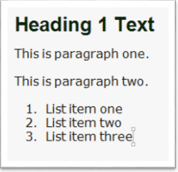
Example: I have a page consisting of a Heading 1, two paragraphs, and a numbered list with three list items. That page may look like this.
If we were to look at a high level, simplified version of the underlying code elements on this page it would look something like:
<body>
<h1>Heading 1 Text</h1>
<p>This is paragraph one.</p>
<p>This is paragraph two.</p>
<ol>
<li>List item one</li>
<li>List item two</li>
<li>List item three</li>
</ol>
</body>
If we analyze this page we can see that there are five different types of elements at work here, body, h1, p, ol, and li. If we look at the parent/child relationships for this page we can also see that all of the li elements are children of the ol element. We can also see that the ol, p, and h1 elements are all children of the body element.
Given the page above, I can tell very quickly if someone understands CSS inheritance by giving them a simple task. If I tell them that I want them to write a style sheet that will render the entire sample page in the font "Tahoma" then I will get two typical results.
If someone does not understand inheritance then they will usually write three styles:
h1{font-family: Tahoma;}
p{font-family: Tahoma;}
li{font-family: Tahoma;}
While the page will now render correctly according to my task, it is technically not a good set of style rules as the author did not use the inheritance model to their advantage. Someone who properly understands CSS inheritance could achieve the same result with a single written style:
body{font-family: Tahoma;}
Since the h1, p, and li elements in this page were all children of body, they will all now render using the Tahoma font as they inherited that font-family property from their parent element, body.
The result of this inheritance model is that it can drastically reduce the number of style rules that we may have to write, and the style rules that we do write can be much simpler than in a word processor if we leverage this inheritance.
To sum up best practices for leveraging inheritance, if the majority of our text including items like paragraphs, lists, table cell content, etc. will have a common look and feel, such as a consistent font, size, and color, then all of those style properties should be written once on the body style and then be allowed to inherit through the entire document. Then, the only additional styles that we would need to write would be for any content that needs to be displayed in a different fashion.
3) Not Using DIV and/or SPAN Elements
While my first two points above were in the realm of CSS theory or best practices, this point gets much more into some mechanics of implementing CSS.
In a markup language/CSS environment all content is comprised of elements (such as P, H1, LI, etc.), and the elements contain the actual content. As a result applying styles is very different than in a word processor. In a word processor, you apply styles to the actual text. In a markup language like XML, you can't do that. You have to apply your style information to the element (the "tags") which contain the text. As a result, our style rules are already removed or abstracted one level from the actual text that we are trying to control. Not a big deal you think, I can still style my paragraphs and headings and such, but then you want to make just one word bold and yikes, there is no element to apply the style to. What can we do? This is where your two best friends, the DIV and SPAN elements come into play.
DIV and SPAN elements are markup elements that can be used to wrap existing content or elements on your authored page to let you apply additional style information wherever and however you want. The difference between them is that DIV is a block-level element (can contain other elements) and SPAN is an inline element (is used entirely within an existing element such as a paragraph).
If we go back to the original example in point one above, where the author wanted to style any text referring to interface elements, then this would best be done using a SPAN element. If the original paragraph looked like:
<p>Click on the Advanced Tab to select it...</p>
In that paragraph the text "Advanced Tab" is the interface element that should have the special formatting. To achieve that formatting we would create a SPAN style in our style sheet such as:
span.interfaceelement {font-weight: bold; font-style: underline;}
Now that we have our style defined we can go back to our paragraph which currently is:
<p>Click on the Advanced Tab to select it...</p>
Now we can modify it by wrapping the interface element text in a span like this:
<p>Click on the <span class=”interfaceelement”>Advanced Tab</span> to select it…</p>
As you can see, we can use these SPAN elements and SPAN style classes to obtain any character formatting that we need. The important part though is that no formatting is embedded in the content page itself. The only information on the page is what this content is (an interface element) and it is the external style sheet that then controls what an interface element should look like. Now, if this SPAN were used in one thousand topics when marketing changes the corporate style guide I simply update the style sheet and all interface element items in all one thousand topics would update to the new look and feel instantly.
Now SPAN has a bigger brother called DIV. Why would I ever use a DIV element and style? If we go back to the sample I used in point two above where we had multiple elements on the page:
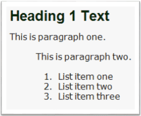
What if I wanted the second paragraph and the list to have a special indent? This can easily be achieved using a DIV element and style combination. If we look again at the simplified code example for this page:
<body>
<h1>Heading 1 Text</h1>
<p>This is paragraph one.</p>
<p>This is paragraph two.</p>
<ol>
<li>List item one</li>
<li>List item two</li>
<li>List item three</li>
</ol>
</body>
I can see that somehow I need to get the second <p> element and the <ol> element to both be indented. The rookie or beginner would likely write two custom styles p.indent and ol.indent and then manually apply them. Would that work, yes, but is inelegant and could cause problems down the road for future edits. A much better solution would be to use a DIV element and style.
In my style sheet I could add the style:
div.indent { margin-left: 5em;}
Then in the page that originally looked like:
<body>
<h1>Heading 1 Text</h1>
<p>This is paragraph one.</p>
<p>This is paragraph two.</p>
<ol>
<li>List item one</li>
<li>List item two</li>
<li>List item three</li>
</ol>
</body>
We could modify it to look like:
<body>
<h1>Heading 1 Text</h1>
<p>This is paragraph one.</p>
<div class=”indent”>
<p>This is paragraph two.</p>
<ol>
<li>List item one</li>
<li>List item two</li>
<li>List item three</li>
</ol>
</div>
</body>
Now all of the content inside of the DIV element will gain an indent of five em units. The page would now look like:
I was able to achieve my indent requirement with only a single new style and without altering the original content elements of the paragraph and list. This is much more elegant and much easier to maintain in the future.
One key best practice when using DIV and SPAN elements it to be as semantic with your naming conventions as possible. I personally would never create a style class named span.bold . Instead, why is the content going to be bold? Is it an interface element? Is the content a book title? Is the content an address? In each of those cases I would create styles such as:
span.interfaceelement
span.booktitle
span.address
This would make the elements much more meaningful to the overall publishing process and much easier to control and maintain in the future.
Summary
This short article is by no means the end of beginner mistakes that I have seen when dealing with CSS but was meant to showcase some of the mistakes that would be the easiest to avoid and provide the most benefit with the least amount of effort.
I would encourage everyone to learn as much about CSS as they are comfortable with and there are many great resources available. MadCap Software presents monthly free webinars on various subjects and earlier this year I finished an entire four-part series taking a much deeper dive into beginning CSS than we have room for here. If anyone is interested in viewing the recordings they can be found here:
I hope that this information was helpful, and thanks for reading!
Editor's Note: Originally published on September 2, 2015.


