Something must be going around as I have suddenly received several requests for adding non-scrolling regions to topics in WebHelp. If you are not familiar with non-scrolling regions they date back to the days of volcanoes, dinosaurs, and the Microsoft Winhelp format circa Windows 3 and Windows 95.
The non-scrolling region was an area at the top of every topic where the topic title was displayed and then the topic itself scrolled under the title. The nice bit is that this ensured that the topic title was always visible. When Microsoft moved on and developed the Microsoft HTML Help format they did not include any methods for including the non-scrolling region and adopted more of a web-style interface. Many cried, shrieked, and rent their clothing longing for the beloved non-scrolling region, but alas it was gone...at least, for a while.
Now fast forward to modern Cascading Style Sheets (CSS) capabilities and you once again can get your non-scrolling regions back! To build a non-scrolling region in Flare we will be updating three styles in the project style sheet. No code, no script, no digging around with Notepad, just some simple style sheet changes.
For this exercise I will assume that the project is already using a Flare Master Page to render breadcrumb trails at the top of every topic, and that we want to keep those breadcrumb trails as part of the non-scrolling region. To accomplish this we will be updating the following styles:
H1, or a customization thereof
MadCap|Breadcrumbs Proxy
Body
To start out, we will modify our H1 style. If you have used H1 styles only at the top of topics then you could just change the attributes for this style directly. However, if you have used H1 styles in other locations then you may want to create a custom H1 style for more control. In this example I created a style class called H1.ns, ns for non-scrolling. Once I had this custom style I applied the following attributes.
background color - Choose the color you want for your non-scrolling region
border-bottom - Choose the color you want for the line under your non-scrolling region
left - Set the distance from the left edge of the browser window. This should be 0.
margin - Distance to the edge of the browser window, again, should be 0.
padding - Distance from edge of the block to the actual content, adjust to style requirements
position - This is the critical piece, it must be set to "fixed".
right - The opposite of left. Should be 0.
top - Distance to the top of the browser window. If you are not using breadcrumbs then 0, otherwise enough space to clear the breadcrumbs.
width - Set to 100% to make sure that your non-scrolling region fills the width of the page.
My sample settings looked like this in Flare:
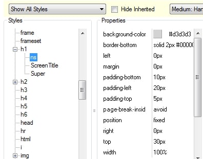
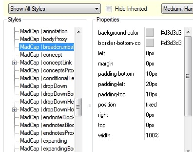
Our heading 1 is now ready to act as a non-scrolling region. However, we need to make sure that our breadcrumbs act in a similar fashion. We will make adjustments to the same style attributes as we did for our heading 1, but with some minor variations so that the breadcrumbs will render above the heading 1 text. The values that I used for the breadcrumbs proxy are:
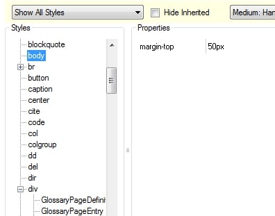
Finally we need to make one minor adjustment to the body element in our style sheet. We need to increase the margin-top attribute to make sure that none of our topic text ends up hidden behind our non-scrolling region. In this example a value of 50px worked well, but adjust as necessary.
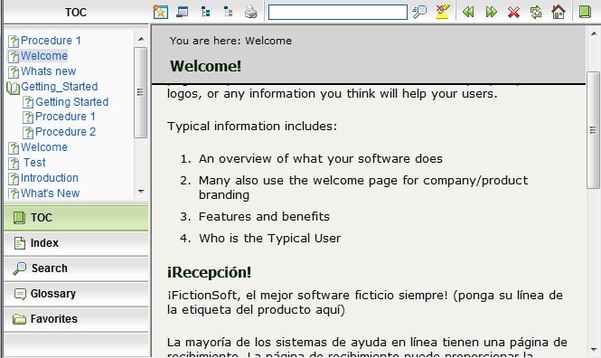
That was all that it took! Adjusting three styles and the result was a WebHelp system where the breadcrumbs information and the heading 1 of every topic was in a gray box at the top of the page...
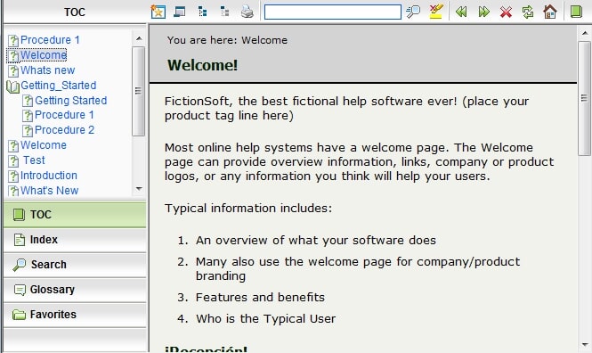
...and when you scroll the topic slides under the non-scrolling header region.
For those who want to add non-scrolling capabilities to your own projects use these values as a starting point, but experiment and get the look and feel that best fits your needs.
Cheers!
Mike
