Flare 11: reinventing the industry, again
A review of MadCap Software’s latest release reveals a treasure trove of new features, functionality, and improvements, by Patrick Calnan.
I should begin with a confession… I am a fan of MadCap Flare and have been since I first started using Flare 3 back in 2007. Once, I even went so far as to upload a homemade video to YouTube® called ‘How MadCap Flare Made Me Look like a Rock Star’. Of all the tools that I have used in my career as a technical communicator, Flare has been the most useful and most powerful. It has had a dramatic impact on my effectiveness as a writer and on my efficiency as a publisher of online help and other technical documents.
Which is why it should not be surprising that whenever a new version of Flare becomes available, I have a tendency to rub my hands together with glee in anticipation of the new capabilities that I can ‘play’ with. Some might question my fondness for what is, after all, simply software but considering the large number of hours that I spend every day working with this tool, a certain attachment to its benefits is hopefully understandable.

I have been fortunate enough to be invited to participate in the beta testing of several releases of Flare now and when I received the invitation to test the pre-release version of Flare 11, I jumped at the opportunity to get a sneak preview of the new version’s ‘bells and whistles’.
I am happy to report that there are quite a lot of ‘bells and whistles’ as Flare 11 includes a number of powerful new features as well as resolving some of the weaknesses of previous releases.

Figure 1. Screen capture of the Build window
Building and working at the same time
For myself, one of the most important and useful changes with Flare 11 is the death of the old Build Progress dialog box and the ability to generate targets while continuing to work on your Flare project. This is a significant improvement because in the past, building a target meant that you could not do anything else in Flare and that you had to wait for target generation to be completed before you could continue your work. For particularly large targets, this often meant that I would literally get up and walk away from my computer, as it would be some time before I could resume working in Flare.
Those days are over. Now, generating targets takes place in the background and you can continue to type and edit your topics while the builds are being compiled. No more waiting for a build to be completed as multi-tasking in the Flare interface has been greatly enhanced.
Those who have been working with Flare for some time now will be familiar with building targets using the madbuild command line option. Some of us ‘old-timers’ remember using DOS and putting together batch files using successive lines of commands. That proved to be a handy skill if you wanted to automate your builds and generate targets without even opening the Flare UI (user interface). Scheduling target generation was also possible using the batch files and scheduling tasks through the operating system but the need to do all of that became redundant when Flare introduced the ability to schedule batch targets (one of my favourite developments of recent releases).With Flare 11 and its new and improved build functionality, you can now have all of the benefits of command line target generation without having to remember any of the syntax or format rules.
The Builds window (Figure 1) that displays the progress of target generation jobs is, like all of the elements of the Flare UI, completely customisable in that you can float the window and place it anywhere on your desktop that you like. One of the more interesting aspects of the new functionality is that you can start the generation of one or more targets in one Flare project; close that project while the targets are still building, and then open a new project to begin working on other things. The fact that target generation is now independent of the UI itself means that depending on how long it takes several targets to be generated, you could actually initiate several builds from several different projects. This could, of course, have an impact on your system resources as your processor works away through all of the generation jobs that you’ve started but it’s a very useful capability to be able to switch Flare projects without worrying about how that affects target builds that are still in progress.
You can still only have one project open at a time in the Flare UI but the ability to build targets from more than one project at a time is a significant leap forward in improving a writer’s productivity.

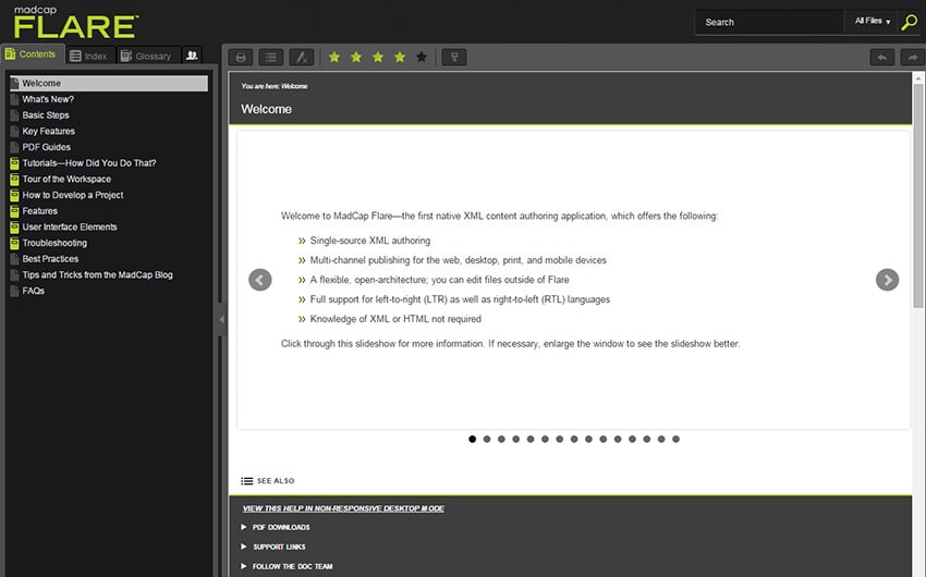
Figure 2. HTML5 output in tripane format
Moving beyond the tripane format
Like most applications (or at least, successful ones), Flare constantly evolves and in previous releases, web output was based on the old HTML frames structure which placed limits on the appearance and organisation of online help. The implementation of HTML5 improved matters somewhat but we were still restricted to the use of a tripane structure: navigation pane on the left, content pane on the right, and toolbar on top (see Figure 2).
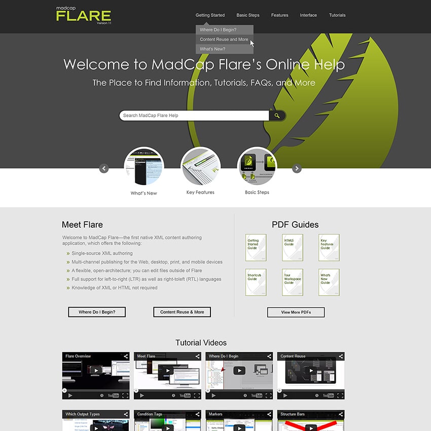
Flare 11 changes all of that with the introduction of frameless top navigation (Figure 3) designed to make HTML5 output look more like a modern web site. MadCap even includes useful templates that you can customise to help you migrate your previous tripane HTML5 targets to the new model. Alternatively, you can start from scratch and create your own top navigation structure with a brand new Flare project. There is a little bit of extra work involved in configuring the skins needed to take advantage of the top navigation feature but after you have invested a bit of time and energy, you will find that the payoff is substantial as the appearance of the new structure is very slick.

Figure 3. Frameless HTML5 output with top navigation
Another interesting update to Flare HTML5 targets is an improvement on the responsive design configuration with ‘device width media queries’. With the addition of responsive design capabilities in Flare 10, HTML5 targets could adapt the structure of the output based on the width of the display. This gave Flare users the ability to produce output that was adaptable to desktop computer screens, tablets, or even mobile smartphones. To test or mimic these settings, it was possible to change the size of a browser window on a desktop computer screen and watch as the output adapted to narrower or wider display widths.
Using this feature allows you to design your output so that the display changes based on whether the screen used belongs to a computer, tablet, or phone.
Positioning the elements absolutely
Not all technical communicators are ‘control freaks’ but it can be an important aspect of our job to be able to have finite and absolute control over where things go in technical documentation. This is especially true of print outputs but can also apply to different elements of web outputs. This is where Flare 11’s new Absolute Positioning feature comes in.
With Absolute Positioning, you can now control exactly where an image, paragraph, list, or other document element is placed. You can also control the way in which text wraps around the document element. In addition, you can do all of this either using styles or through local formatting.
Although I did not write this article in Flare11, you can see examples of how Absolute Positioning works in the image files that are included with the text.
When you apply Absolute Positioning to a document element in Flare 11, you remove it from the normal flow of the text and place it wherever you like, controlling how the rest of the text flow interacts with the element. You can position the element relative to a ‘parent’ element or relative to the document itself (in this case, an individual Flare topic).
There is an important concept to keep in mind when using this feature that may be new to Flare users: z-index. The z-index of a document element is the value assigned to it that indicates its placement in terms of ‘stacking’ elements. For example, assigning a z-index value of zero (0) to an element means that it is on the same ‘level’ as the surrounding elements and so text will wraparound it. If an element has a z-index of negative one (-1), it is placed behind the surrounding elements (similar to a watermark). A z-index of one (1) would then place the element ‘in front of’ or ‘on top of’ surrounding elements so that they disappear behind it. The Flare icon located behind this paragraph is an example of an image file with a z-index of negative one (-1). Using the z-index and other aspects of Absolute Positioning, you cannot only control where an image or paragraph or other element appears but also the behaviour of other elements in relation to it including margins or padding to increase or decrease the space surrounding the element.
I really liked the Absolute Positioning feature but for myself, I suspect that it will probably be more applicable to PDF than online outputs.

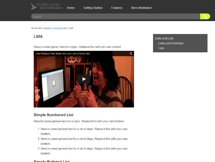
Figure 4. YouTube® video embedded in a topic
More multimedia
Multimedia support has been seriously upgraded as Flare 11 now supports Universal 3D (U3D) files in both online and PDF outputs. Imagine the impact that a 3D model can have on your audiences they click-and-drag to move the image around and gain a new perspective on the subject that you're documenting.
YouTube® and Vimeo® movies can now be embedded directly into topics or snippets (Figure 4) and you can control whether or not to start the video automatically when it is displayed in an online output. Embedding a YouTube® or Vimeo® movie directly into your Flare output differs from simply linking to it as you can configure how the video appears within your content.
Another fascinating multimedia enhancement included with Flare 11 is the support for adding augmented reality to your projects. Augmented reality is when users can scan an element of your content with a mobile device and access additional material (such as audio, video, or 3D models) from another source. With Flare 11, the augmented reality comes in the form of an image that you embed in your content and then export to Metaio Creator. You would then use Metaio Creator to create and publish your augmented content. Flare 11’s integration with Metaio Creator even supports augmented reality in print outputs as the user’s mobile device can scan images in a number of different formats. This is a rapidly growing industry and Flare is the very first technical authoring tool to make this integration seamless. I have only just started experimenting with this tool myself but I can see how augmented reality will become an increasingly important component of technical documentation in the future. MadCap’s innovation in this area is definitely starting a potentially powerful trend.
Flare 11 also includes new support for image maps in PDF outputs. If you have gone to the trouble of configuring an image map primarily for your online outputs, you can now use the same feature in PDF files. There is a limitation, however, in that image maps in PDF outputs can only use rectangular-shaped map objects. Circular or polygonal objects are redrawn as rectangles so you will probably want to revisit any existing image maps beforehand to make sure that they will translate to PDF format nicely.
Expanded capabilities
The list of other improvements and new features in Flare 11 is impressively long and addresses a range of documentation needs.
One interesting new feature is PDF Stitching that allows you to combine several existing PDF files into one cohesive PDF file using Flare. Outline outputs have allowed you to attach PDF files into your content but their format remained intact and it was similar to accessing a PDF file from a conventional web site. However, the stitching feature allows you to combine multiple PDF files into one file, which can be a useful way to take advantage of existing content in PDF format without having to convert it to XHTML beforehand.
When MadCap Software announced their acquisition of Doc-To-Help at the beginning of this year, many observers anticipated that the integration of the two tools would take place quickly. We have not had to wait very long at all, as one of the new features introduced with Flare11 is the ability to import Doc-To-Help files. I am not a Doc-To-Help user myself and so I was not able to test this feature but the capability to be able to convert from .D2H files will definitely help those that use both tools and anyone who is migrating from Doc-To-Help to Flare.
Every new release of Flare expands their source control capabilities and with Flare 11 comes integration with Git and TFS (Team Foundation Server) integration with Visual Studio Online. I am a Perforce user so I was not able to try out these features myself but adding more source control functionality to join the ranks of Microsoft® Team Foundation Server®, Visual Source Safe®, Subversion, and Perforce® only increases the tool’s usefulness. The ability to check in and check out source files without leaving the Flare UI is a valuable timesaver and now Git users can take advantage of that feature.
Shortcuts and helpful tools
I am sure that I am not alone as a technical writer in occasionally having to perform repetitive tasks or that I have to do certain functions in Flare over and over again. For years, I have used a keyboard macro utility to record the more common tasks that I have to perform. With Flare 11, however, I can set that utility aside as the ability to record, playback, and manage macros has now been added. This will be a tremendous productivity booster as now that I can ‘automate’ certain processes that I perform regularly, I can shorten the amount of time and effort it takes to do so.
Moreover, if being able to record macros was not enough, Flare 11 introduces the ability to customise your own keyboard shortcuts. Flare has had keyboard shortcuts for years but now you can modify existing shortcuts to come up with your very own. I have always loved the way that you can customise and personalise the Flare interface to suit your own work habits and this simply adds to that capability.
As you can tell, I am always looking for ways to make my work faster and easier, which is why I really like the new Quick Launch tool. This dislocated in the menu bar at the top right corner of the screen and is a search field where you can type the name of any Flare command, feature, or filename. For example, type ‘Build’ and the Quick Launch tool will provide you with direct access to starting the builds of your targets. Click on the link displayed in the menu below the Quick Launch field and the command you selected starts right away. This can be a fast way to avoid switching back and forth between different ribbons in the Flare UI and once you get used to it, it is a real time-saver.
Speaking of time-savers, would it be useful to be able to access frequently used projects, fonts, or styles especially from long lists? Flare 11 introduces a new feature called ‘pinning’ where you can ‘pin’ your favourite item in a long list so that it is displayed at the very top. For example, if the list of recently opened projects in your Start Page is long, you can hover over the name of a favourite project and click the thumbtack icon to have it ‘pinned’ so that it appears at the top of the list. You can do this with frequently used fonts and styles which can make it much faster to find something than having to scroll through a very long list.
But wait… there’s more!
There are so many improvements and new features in Flare 11 that it is difficult to capture all of them in a single review article. To mention a few more, Flare 11 includes very useful upgrades to their embedded search engine including a new search algorithm to improve search rankings, updates to their search filters, and a reduction in the use of file resources to make online outputs more efficient.
Flare 11 also includes a host of improvements to existing functionality including:
- Cross-References
- Dictionaries and Spell Checking
- File List
- Font Properties
- Slideshows
- Snippets
- Styles
- Target Editor and Batch Target Editor
- Variables
- XML Editor
This is not a complete list of all the new changes in Flare 11 as I ran out of time trying to explore all of the new options but you can correctly assume that I will be spending a lot more time trying out Flare11’s new capabilities.
Appraisal
I admitted my bias at the beginning so it should not be a big surprise that I am giving Flare 11 a very positive rating. In my opinion, the improvements in target generation alone mark this release as an unqualified success. Frameless HTML5 outputs are another significant game changer. The long list of new features and enhancements that are also included only furthers my impression that Flare 11 is a definite winner.

About the Author
Patrick Calnan
A self-professed MadCap Software "fanboy" (it's his YouTube name), Patrick Calnan is a long-time user of MadCap Flare and other documentation tools and has worked as a technical writer for 20 years. He is currently a part-time Professor in Algonquin College's Technical Writing program.


