


Ever wondered how the “tiles” and “boxes” on the home page of certain MadCap Flare templates respond to the screen size of different devices? If you visit our page of responsive HTML5 templates for MadCap Flare, open one of the theme previews in your desktop web browser, and then resize the width of the browser window, you will see that the tiles are automatically rearranged in a vertical layout. This may seem like wizardry to novice and intermediate users, but Flare’s Responsive Layout Window makes creating these elements accessible and simple.
These elements are coded to be responsive using HTML and CSS. There are frameworks you can use like the Zurb Foundation grid system, but the Responsive Layout Window lets you add these elements with an easy-to-use UI within Flare.
How does the Responsive Layout Window work?
When you add these elements using the Responsive Layout Window, you are working with a “row” that will contain a certain number of “cells”. In the underlying XHTML, the row is a div that contains other divs. Each div nested inside of the parent div acts as one cell, and these are the units that will appear as individual tiles in the output.
<div class="Row">
<div>
<p>Cell 1</p>
</div>
<div>
<p>Cell 2</p>
</div>
<div>
<p>Cell 3</p>
</div>
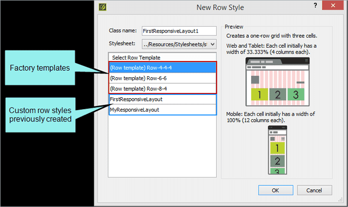
</div>Before you can insert a row, you must specify a row style, or class. A row style determines the number of cells you will have in the row. When you select New Style in the Responsive Layout Window, the New Row Style dialog opens with some default styles available to choose from. But how can we make sense of those style names, like “Row-4-4-4” or “Row 6-6”?
Imagine a row of twelve columns that spans across the page. The width of each cell is expressed by the number of columns it will span in the preset row styles. For example, Row 4-4-4 contains three cells and each cell is the width of four columns. Row 6-6 contains two cells, each the width of six columns. Row 8-4 also contains two cells, but one cell is the width of eight columns and the other cell is the width of four columns.
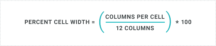
To get the number of columns per cell, divide the total number of columns (twelve) by the number of cells.

The width of each column is expressed in percentage values calculated from the number of columns per cell over the total number of columns.
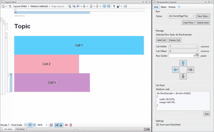
The percentage value evaluated for the cell width will be added to the stylesheet. The screenshot below shows a demo project I created to help illustrate how to work with cell widths.
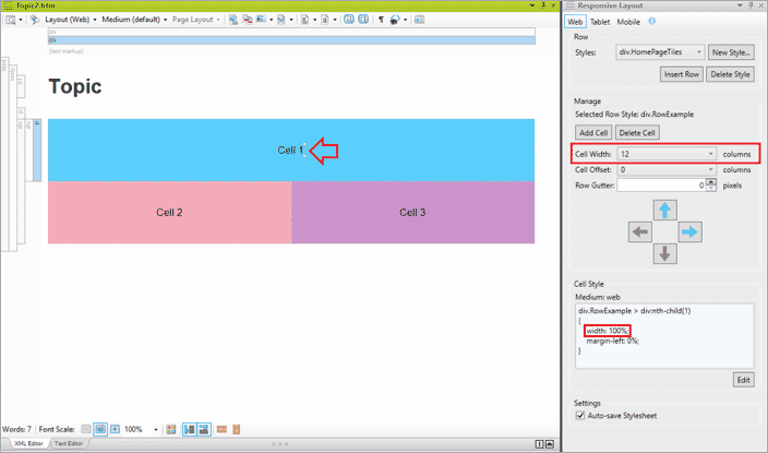
With the Responsive Layout window open and the cursor inside Cell 1, we can see that the width of 12 columns translates to 100%. These values are highlighted by red boxes.
Below, we can see how the widths of Cells 2 and 3 would be calculated.
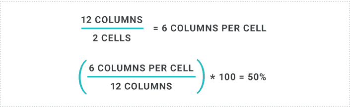
Cells 2 and 3 will each have a width of six columns, and we can demonstrate that this will evaluate to 50% width in the CSS.
If the total width of cells in a row exceeds 100%, a cell will move downward and create the appearance of a new row below. In the example above, Cells 2 and 3 would have been in the same row as Cell 1, as their combined total width did not exceed 100%, but this is not possible because Cell 1 by itself has a width of 100%. This also occurs after setting the width of Cell 3 to seven columns in the screenshot below.
You can also customize rows with cells that are not all the same width, as long as the total width of all cells is less than or equal to 100%.
How do I make the output responsive?
The true utility of the Responsive Layout Window lies in its ability to automatically set up the stylesheet styles for a row’s divs in different stylesheet mediums. Mediums and media queries in the stylesheet allow you to configure styles that come into effect when the user’s viewport is a certain width, which is a proxy for the type of device they use. For example, Flare’s HTML5 templates are configured to invoke the “mobile” medium for mobile phones when the content is displayed in a window less than 767 pixels wide.
To edit a responsive row for different mediums, select the medium at the top of the Responsive Layout Window, then set your desired settings such as cell width while placing your cursor in each cell.
When the Web medium is selected, stylesheet styles are added to the default medium of the stylesheet. Selecting Tablet will add styles to the tablet medium, and Mobile adds styles to the mobile medium.
What about space between cells?
If the total width of the cells in a row adds up to 100% (12 columns), there will be no room for space between the cells, and not all users will want this. The Responsive Layout Window allows you to select a value for Cell Offset, measured in number of columns. The Cell Offset value in columns will be converted to a percentage value, which will then be added to the stylesheet rule-set for the div as the value of the property margin-left.
Increasing margin-left via Cell Offset adds to the total width of a row, so you run the risk of exceeding 100%, unless you account for the combined width of the cells and the left margin applied to them.
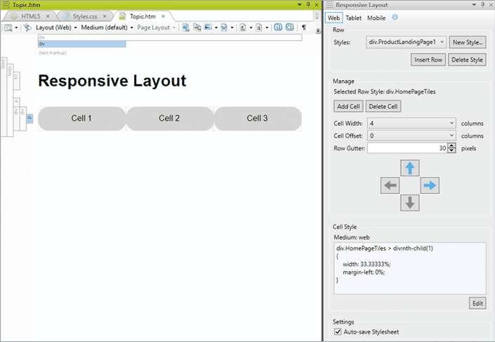
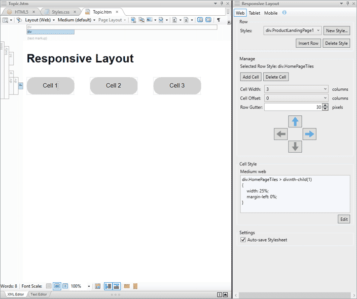
Let’s say you need a row of three tiles on your home page with links to resources. For simplicity, they will all be equal width. To begin, create a new row style by selecting New Style… and base it off of the factory template Row 4-4-4. Recall that the total width of a row is twelve columns, so each cell in the row will have a width of four columns each. After creating or selecting a row style, place your cursor in the XML Editor and select Insert Row. To make the cells visually distinct, I have added a background-color, border-radius, and some top and bottom padding to the cells so that it looks like this:
Say you decide to add a little bit of space between Cell 1 and Cell 2, and Cell 2 and Cell 3. Place your cursor in Cell 2 and change the Cell Offset to 1. Immediately, an issue appears with the row because the total width of the cells and the left margin combined exceeds 100%.
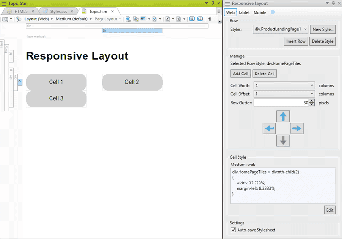
As aforementioned, we must account for the total width of all cells, in addition to the margin applied via Cell Offset. Currently, we have three cells with 33.333% width, and one of the cells is shown to have margin-left of 8.333%, which adds up to (3*33.333%) + 8.333% = 108.333%. If you think in terms of columns, we have three cells with the width of four columns, plus an extra column of offset, which adds up to (3*4) + 1 = 13 columns, but a full row consists of just 12 columns.
You can resolve this by reducing the width of the cells. A simple resolution would be to set the width of each cell to three columns, and apply the remaining column of Cell Offset to Cell 3, which yields the following:
However, the row will not be exactly centered in the HTML5 output and does not span the whole width of its parent div.
If you want this row to have perfect symmetry across the page, it is possible to change the exact width percentage values in the stylesheet. The Cell Style field in the Responsive Layout Window shows you the CSS rule-set that styles the cell in which your cursor is placed.
Say you decide that the row would look better with more symmetry. With the Responsive Layout Window, you’re left with choosing Cell Offset values of 0 or 1 even though you want something in between. For these situations, you can make even more precise adjustments by editing the stylesheet directly. To learn how to do this, let’s dive deeper into the CSS that styles the responsive row.
How do I edit the responsive layout CSS?
The previous screenshots show us that the Responsive Layout Window displays the CSS rule-set that styles a cell in the Cell Style field. Here is the rule for Cell 1 in our example:
div.HomePageTiles > div:nth-child(1)
{
   width: 25%;
   margin-left: 0%;
}
The selector for this – div.HomePageTiles > div:nth-child(1) – makes use of the CSS combinator >, or child selector, and the nth-child pseudo-class. Therefore, the rules in the braces after this selector will be applied to the first div that is a child of its parent div of the class HomePageTiles, i.e. Cell 1. To select Cell 2, use the selector div.HomePageTiles > div:nth-child(2).
To help make sense of this, take a look at the structure of the HTML for the responsive row below:
<div class="HomePageTiles">
   <div>
      <p>Cell 1</p>
   </div>
   <div>
      <p>Cell 2</p>
   </div>
   <div>
      <p>Cell 3</p>
   </div>
</div>
The div with the class HomePageTiles wraps a child div for each cell in the row. When you select a cell in the XML Editor and edit the value of Cell Width or Cell Offset, it adjusts the percentage value applied to the width or margin-left property in the CSS rule-set.
We have seen how advanced CSS selectors are able to style the individual cells, but what mechanisms allow the Responsive Layout Window to live up to its namesake and actually produce responsive elements? Recall that “responsive” in this context means that the elements will rearrange themselves to best fit the size of the displays on different devices, like desktop computers, tablets, and mobile phones.
A rule-set for each cell’s selector will be added to the default medium, the tablet medium, and the mobile medium of the stylesheet to enable responsive behavior. If you are unfamiliar with the concept of stylesheet media, please refer to the MadCap Flare help article on the subject or this tutorial from W3Schools.
Default medium
You can inspect the CSS in the stylesheet when it is opened in the text editor (right-click > Open with > Internal Text Editor). In the demo project for this post, the rules for the responsive div behavior on desktops are at the bottom of the default medium:
For size and positioning, the only rules you need to be concerned with are those that select the nth-child pseudo-element of each cell:
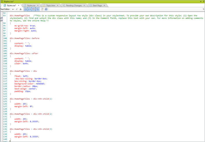
div.HomePageTiles > div:nth-child(1)
{
      width: 25%;
      margin-left: 0%;
}

div.HomePageTiles > div:nth-child(2)
{
      width: 25%;
      margin-left: 8.3333%;
}

div.HomePageTiles > div:nth-child(3)
{
      width: 25%;
      margin-left: 8.3333%;
}
Recall the formula for cell width that is based on the 12 columns. You might expect a row of four cells, not three cells, to use a width of 25%:

It is true that you could have a row comprised of four cells of 25% width with no space in between them. But in this demo, we want space between the cells, so some of the width of the row will be dedicated to that space. Our solution will be to add the necessary value of margin-left to the nth-child(1) pseudo-element rule, and key to finding this value is understanding that a full row takes up a width of 100%.
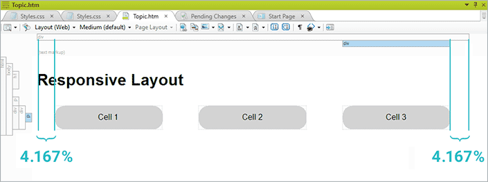
The sum of the widths of all cells and margins in this row will be:
(25% * 3) + (8.333% * 2) = 91.666%
This leaves 100% - 91.666% ≈ 8.333% of space not used by cells or margins.
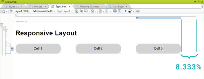
We will divide this value in half and apply it as the value of margin-left for the nth-child(1) pseudo-element. This will add the amount of left margin needed to center the row to the first cell. 8.333%/2 ≈ 4.167%.
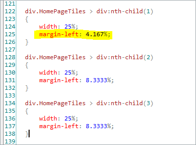
Since the row is right-aligned, we only need to apply 4.167% margin-left on the first cell, and the amount of space to the right of the third cell should be equivalent.
Tablet medium
Next, we need to adjust the cell width and margin values for the tablet medium and mobile medium. Do not feel overwhelmed; the process is exactly the same and often easier for the non-desktop stylesheet media.
To start configuring the cells for tablet, select Tablet in the local toolbar of the Responsive Layout window. This will also cause the XML Editor to display the topic with the tablet medium.
If the cells in desktop mode are too small for a tablet device viewing the output in portrait orientation, you may want to increase the widths of cells so that fewer cells occupy each row. This occurs because the width of the entire row will exceed 100%, so cells will be pushed to a new line.
It is often the case that the size of the desktop cells on a tablet device are usable enough, so in those projects it is fine to leave the tablet medium values untouched and allow the cells to inherit the settings from the desktop (default) medium. However, you have the option to customize the cells for the tablet medium.
Mobile medium
The displays on mobile devices are significantly smaller than desktops, so you will probably want to make adjustments for the cells in the mobile medium. Typically, the width of each cell will be set to 100% so that every row consists of one cell, and the user would scroll through them vertically. Here is an example of this in action on the home page of the Flare online Help:

Flare online Help on desktop.

Flare online Help on mobile.
To set this up in our example, select Mobile in the local toolbar of the Responsive Layout Window. Then, set each cell width to 12 columns (100%) by placing your cursor in the cell in the XML Editor, then selecting 12 from the Cell Width drop-down.
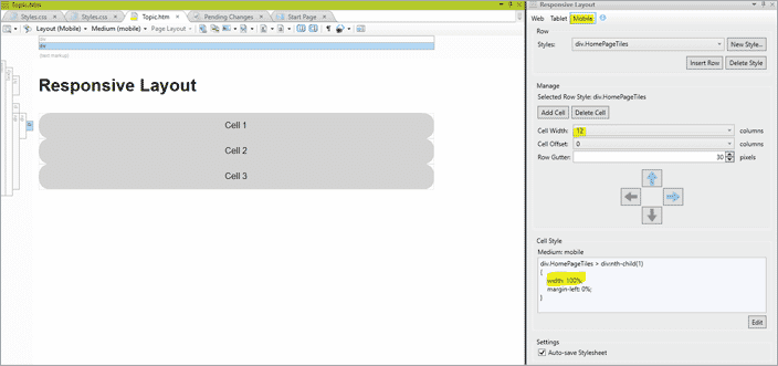
Here are the CSS rules that are added to the mobile medium of the stylesheet:
@media mobile
{

   div.HomePageTiles > div:nth-child(1)
   {
      width: 100%;
      margin-left: 0%;
   }

   div.HomePageTiles > div:nth-child(2)
   {
      width: 100%;
      margin-left: 0%;
   }

   div.HomePageTiles > div:nth-child(3)
   {
      width: 100%;
      margin-left: 0%;
   }
Setting 100% width on each cell makes it easier for users viewing your help system on a mobile phone to see the contents. Each cell occupies an entire row, and the user gets a better view of the cell contents while they scroll through vertically.
Conclusion
The key to successfully creating a responsive row is to consider the number of cells the row needs and then calculate the width and left-margin of each cell in terms of ratios. The Responsive Layout Window expresses these values using number of foundation grid columns, but it is sometimes easier to convert the column numbers to percentages. In the grid there are 12 columns per row, so to calculate the percentage value, take the width in number of columns, divide it by 12, and then multiply by 100.
The Responsive Layout Window allows you to set cell width and margin using number of columns as the unit of measure, but you can make changes to the cell styles directly in the stylesheet using percentage values. For the cleanest appearance, calculate the cell width and margin so that the sum of all widths is 100% in the desktop medium. If necessary, you can set values that cause the row to be wider than 100% so that some contents will be moved to the next row, which is what we have done by setting all cells with 12-column, or 100% width in the mobile medium in the demo project.
It is more and more important to adopt responsive design so that your help systems maintain compatibility with a full range of devices, so bust out your calculators and get creative!


