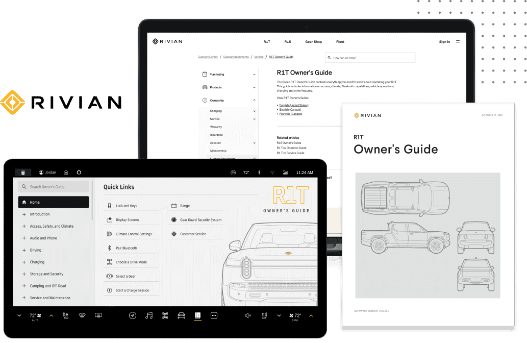
Documentation comes in many forms, ranging from product documentation, software documentation, process documentation, academic guides, user manual, guides, SME documentation, instruction manual, release notes, and more.
But regardless of the technical documentation or format being used for multi-channel publishing purposes, the goal for all technical writers when writing documentation is to provide an end-user or the intended audience with the technical specification they need to get to the right answer or solution. A comprehensive documentation site (or knowledge base) not only offers valuable content; it also has an impact on how users experience and interact with your product and brand.
What are Good Documentation Practices?
When it comes to creating a great documentation site and knowing how to write technical documentation, there are a couple of best practices to keep in mind:
- Comprehensive. Comprehensive documentation covers all aspects of the product, providing detailed information without making assumptions about what the user may or may not know. Examples, code samples, images, videos, and other content can play a role in providing a seamless experience for users in your user documentation.
- Up-to-date. Nothing is more frustrating to an end user than locating an online help topic or support page, only to find that it references an outdated feature or version of a product in your technical documents..
- Easy to Find. Users shouldn’t have to hunt through your site to find the answer. A menu, robust search functionality, related content links, or other easy navigation elements make for a better user interface that makes it easier for users to discover content.
- Visual Appeal. A well-designed knowledge base goes a long way in keeping the end user engaged with your content on your site for effective technical communication. By offering an inviting, clear experience that looks great on both mobile and desktop devices, users are given a consistent look-and-feel that matches your brand instead of ordinary technical writing text across a corpus of dull, lengthy technical documents.
Looking for companies with great technical documentation examples? The following online examples not only offer clear, comprehensive content, they also include elements that enhance the user interface and journey, providing effective technical documentation. And as a bonus for MadCap Flare users - these sites are all created and managed with Flare.
Here are a couple of our favorite technical documents that follow best practices, along with their stand-out features that are essential requirements to create a positive user experience and while providing effective user documentation.
disguise one Help Site
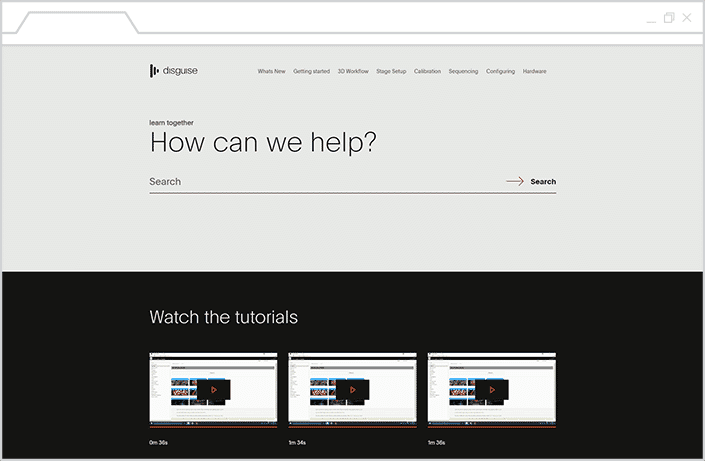
Top Navigation menu. disguise one's navigation menu offers easy-to-access content that looks like a natural extension of the corporate site. Whether users are viewing the site from a desktop or mobile device, the content responds appropriately. In addition, the menu and breadcrumbs quickly let users know where they are in the online documentation plan.
Video guides and tutorials. Throughout the site, users can view embedded videos that offer tutorials on how to use disguise one's products. These training videos offer visual examples that explain how their software works, and help to provide a consistent learning journey for customers that is easily understood.
Suggested content. Each topic page offers related articles and other content that directs the users to relevant resources, pointing them to additional topics that could provide a different angle to a solution. These pages also ensure that they continue exploring the help site for additional user assistance.
Solace Technical Documentation Example
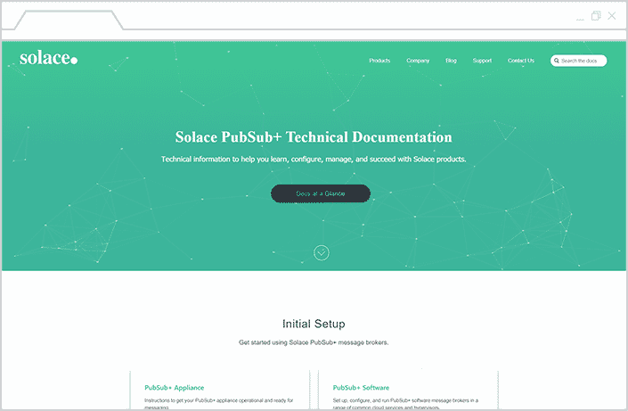
Resources collected in a centralized portal. Finding the right resource is no easy task, even for a technical writer. Solace responds to this need with a clear hierarchy in their navigation, starting with a central portal that lets the user view all the internal documentation from a central hub.
Highlighted search functionality. The search tool takes front and center stage in the Solace documentation site, giving users the ability to quickly find what they’re looking for. And if users need a jumping-off point, they just need to scroll down to get started with their recommended resources, organized by target audience and product.
Cleverbridge Client Support Center Example
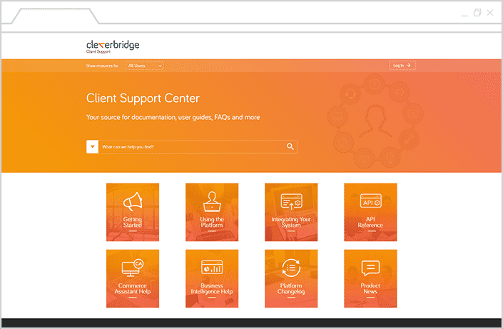
Branded Layout. Cleverbridge’s Client Support Center serves as a seamless extension to their brand. Typography and brand colors are consistent throughout the site, ensuring that users have a streamlined experience as they explore the resources.
Role-based Content Delivery. The site offers a customized experience for different types of users, narrowing down the resources that are relevant to their role. Users can access content specific to their roles by using a drop-down list to choose the appropriate user view.
Sisense Documentation Example
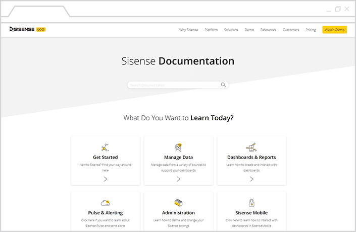
Quick start and easy-to-access guides. The quick start guide is for users that don’t know where to start, Sisense's documentation site features a card layout, which offers users with several options that focus on common features of the platform. In addition, a quick start guide offers a great option for users that are new to the platform.
Seamless feel and integration with corporate website. The clear page organization and intuitive design makes it easy for users to navigate content. In addition, the online documentation site also shares common elements with the main website, providing a consistent experience across multiple touchpoints.
Versioning selection. For users that rely on earlier versions of Sisense’s platform, they have the option to select a customized view of the site. Users are then led to resources that address features specific to their selected version.
Spryker Documentation Example
Code samples. Providing code samples that software developers can test for themselves is a great resource, especially in writing API documentation. Spryker includes plenty of code samples in their user guides, along with copy-to-clipboard links for easy access.
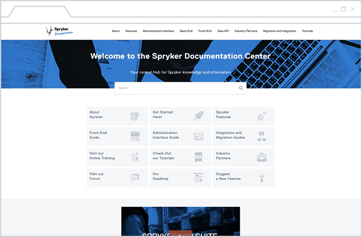
Accessible Content through Search and Navigation. Spyrker's documentation is easy to browse, and robust search capabilities simplifies the process of finding the right answer. The easy navigation menu, which highlights the page or subpage you're currently on, allows for granular categorization of content.
Whether they're searching for a specific technical document, user guide or user manual, software development documentation, product documentation, design documents, or other type of online content, users can readily find the detailed information they need.
Keywords and Popups. Spryker’s documentation makes it easy for users to determine whether a help page is relevant to them with visual cues. Pages are tagged with keywords and popups that display in headings, as well as inline within the text, that conveniently lets users know if features are applicable to their use case.
Conclusion
While each site offers a unique experience, they share a common goal of providing valuable, readily accessible information to their users. Good documentation serves to reduce the number of inquiries to your support staff, and nurture customers into self-sufficient, knowledgeable users of your product. If you make your online and technical documentation relevant, user-friendly, and concise, your users will thank you for providing effective documentation.
Want to see more great technical documentation examples of documentation websites, support portals, knowledge bases, and more? Take a look at our Customer Showcase, which features a collection of responsive HTML5 websites PDF guides for download, all of which are technical documentation examples created with MadCap Flare. For more inspiration, checkout our technical documentation templates.
If you're interested to learn more about technical writing software, checkout MadClap Flare today!
This blog post was originally published on February 26, 2019, and has since been updated on January 4, 2022 and again on July 25, 2022.

